Cummins Engines
Integration of stand-alone product website for Fire Power Drive Engines, into larger Cummins brand site.
site maps
information architecture
low fidelity wireframes
competitive analysis
Overview
Background
Cummins is a world-wide engine manufacturer with franchises spread across the continental United States. In addition to selling and producing engines, they also install and service those engines.

Cummins consolidating franchises as a larger company.
Challenge
In early 2017, Cummins planned to announce the consolidation of their franchises in the larger brand: Cummins, Inc. Before doing that they needed to consolidate stand alone sites for speciality engines, such as their Fire Pump Drive Engines produced in De Pere, WI. The site needed to be integrated into one of the larger brand sites as part of the consolidation effort.
My Role
The product owner of the website had retired a few years prior and with no one updating the site, it had fallen into disrepair. I was brought in to evaluate the existing site, ideate new improvements, and mock up how it would fit into a larger brand site. I worked with internal stakeholders to align on business and internal user needs.
Discovery Phase One
Stakeholder Interviews
I interviewed my team about their current use of the site, and also their wishes for the future site. Because Cummins is a wholesaler and these engines were being repackaged and resold, we didn’t have access to the end site users.
Internal users found the site too confusing to interact with and preferred to bookmark engine specification pages (11 total) rather than interact with the site.
Stakeholders wanted to showcase their competitive edge they felt was being ignored on the site.
Customer service representatives were fielding many calls about installation and training to install and wanted clearer directions for the process for this on the website.
Synthesis Phase One
User Personas
Information from internal stakeholders revealed two main personas: those wishing to buy engines and those wishing to get their existing engines serviced. A smaller portion of users were looking to be trained to install engines; usually, these were people like engineers or technicians who would also be interested in servicing engines.

Buying Bob
Looking to buy an engine to repackage with their fire pump. Needs to know emissions ratings and specifications of engine. Interested in what accessories are offered in case their end client wants a custom build. They may be looking at other engine manfucaturers so knowing what makes Cummins different is important.

Service Sam
Service Sam is a engineer who travels the country servicing Fire Pump Drive Engines. He is trying to find the CFP5E manual to figure out what is wrong with the engine. His client says the engine is under warranty, so he will need to submit a claim once he figures out the issue. Sam also might be interested in learning how to install the engines.
Discovery Phase Two
Competitive Analysis
Clarke, a main competitor had divided their site navigation into engines, parts, and service. While engines addressed the first persona and service addressed the second, parts was misleading and actually contained information about warranty, which falls under service.
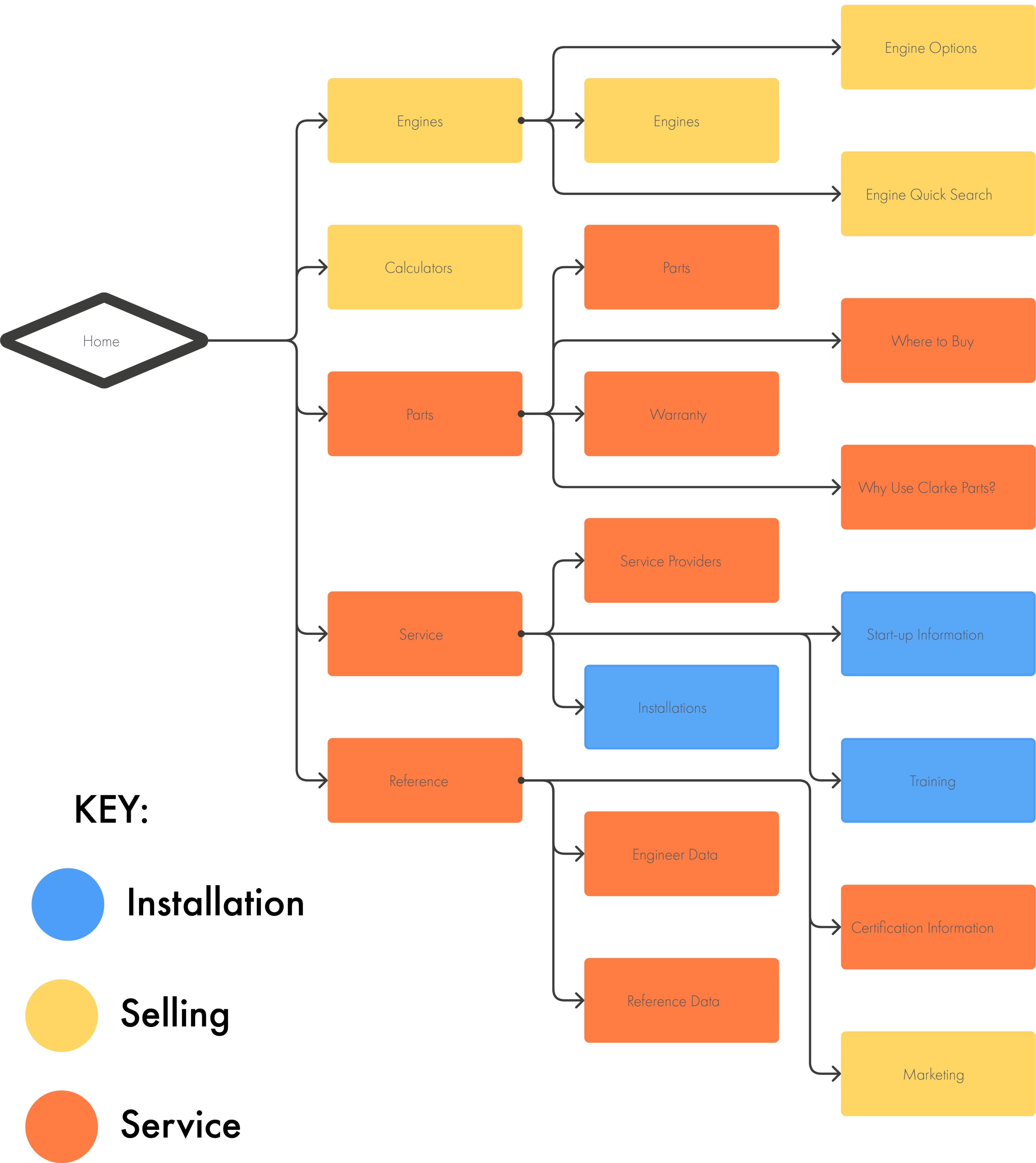
Clarke Site Map: the site is segmented into a part for selling and a part for service.
Synthesis Phase Two
Current Site Analysis
I mapped the original site and noticed pages addressing either persona were scattered throughout. Additionally, we had issues with taxonomy. We referred to start-ups as “application installation,” “installation,” and “start-ups.”
Issue One
To find information, a user had to open 4 different tabs (that all appeared in new windows) and download an external PDF.
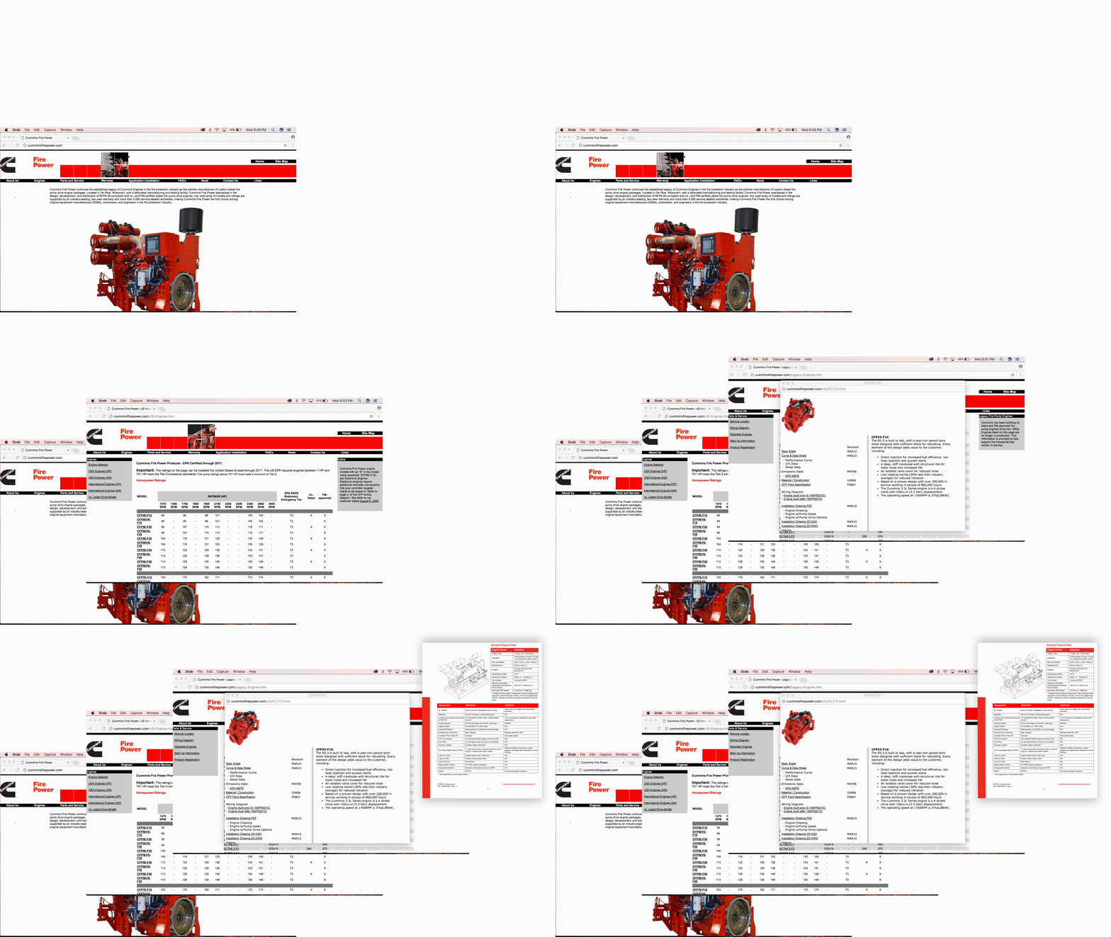
Example of how many tabs need to open to see desired content.
Issue Two
‘Start-up Installation’ was referred to as both "start up" and "application installation".
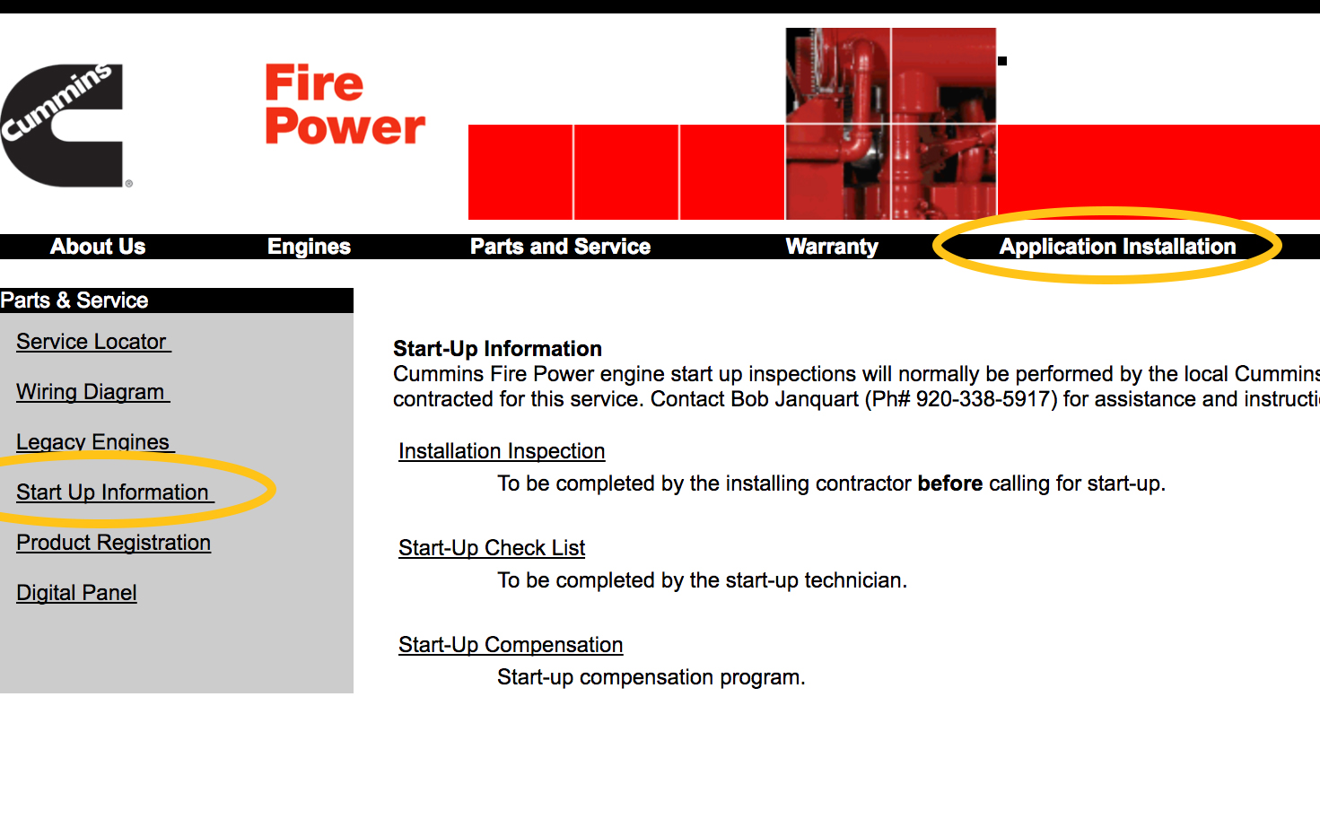
Example of how language differs while referring to same term.
Issue Three
Some information pertinent to our service and installation persona was buried deep in the selling side of the architecture.
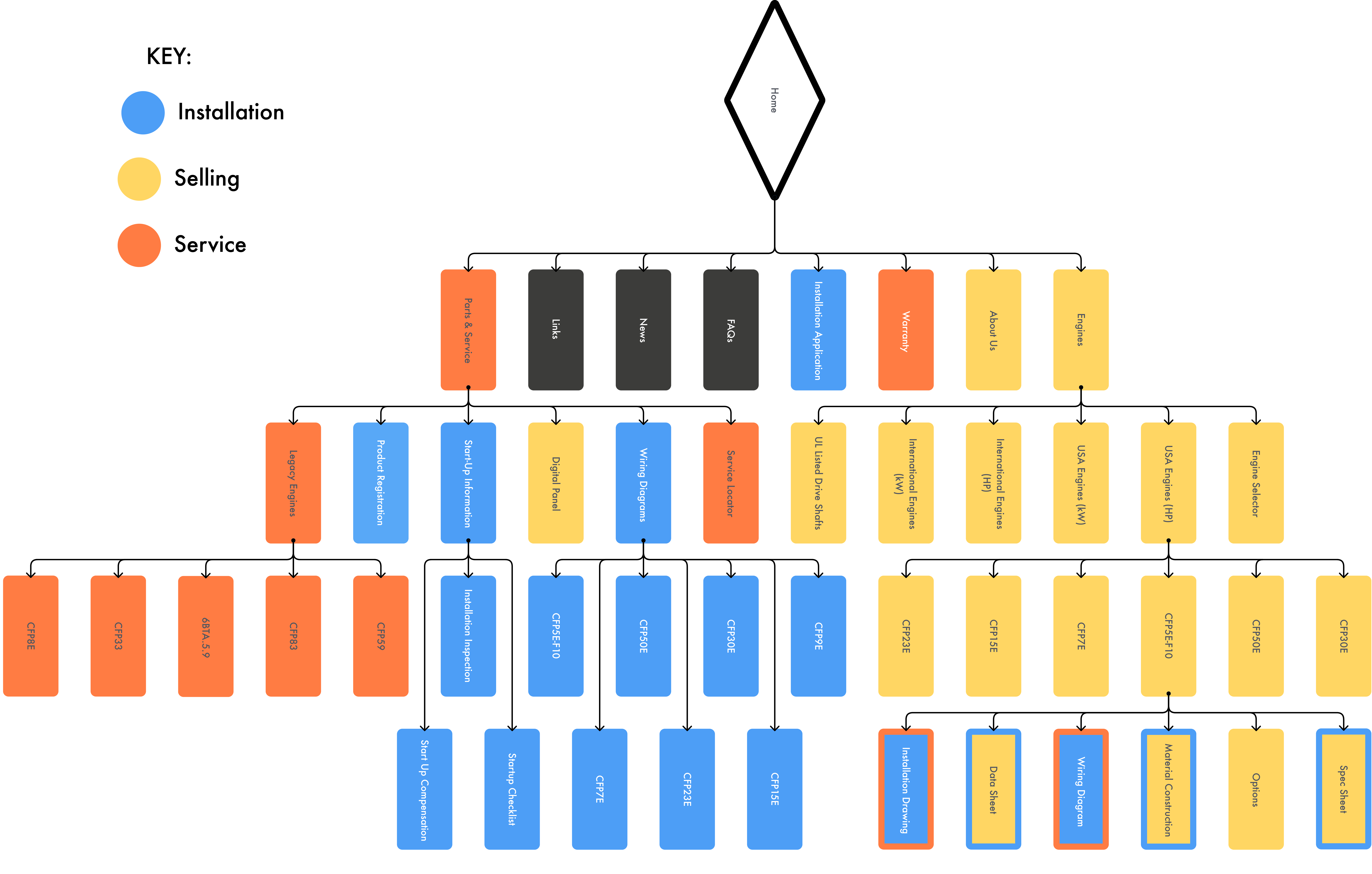
Cummins site map showing some information was cut off from the other relevant information and buried 4 layers deep.
Ideation
New Site Map
I developed a site map that better aligned to these two personas. After talking to internal stakeholders, we settled on putting the information relevant to the third, smaller persona, installation, with service. Since maintenancing and installing had the most overlap, it made sense to group these together.
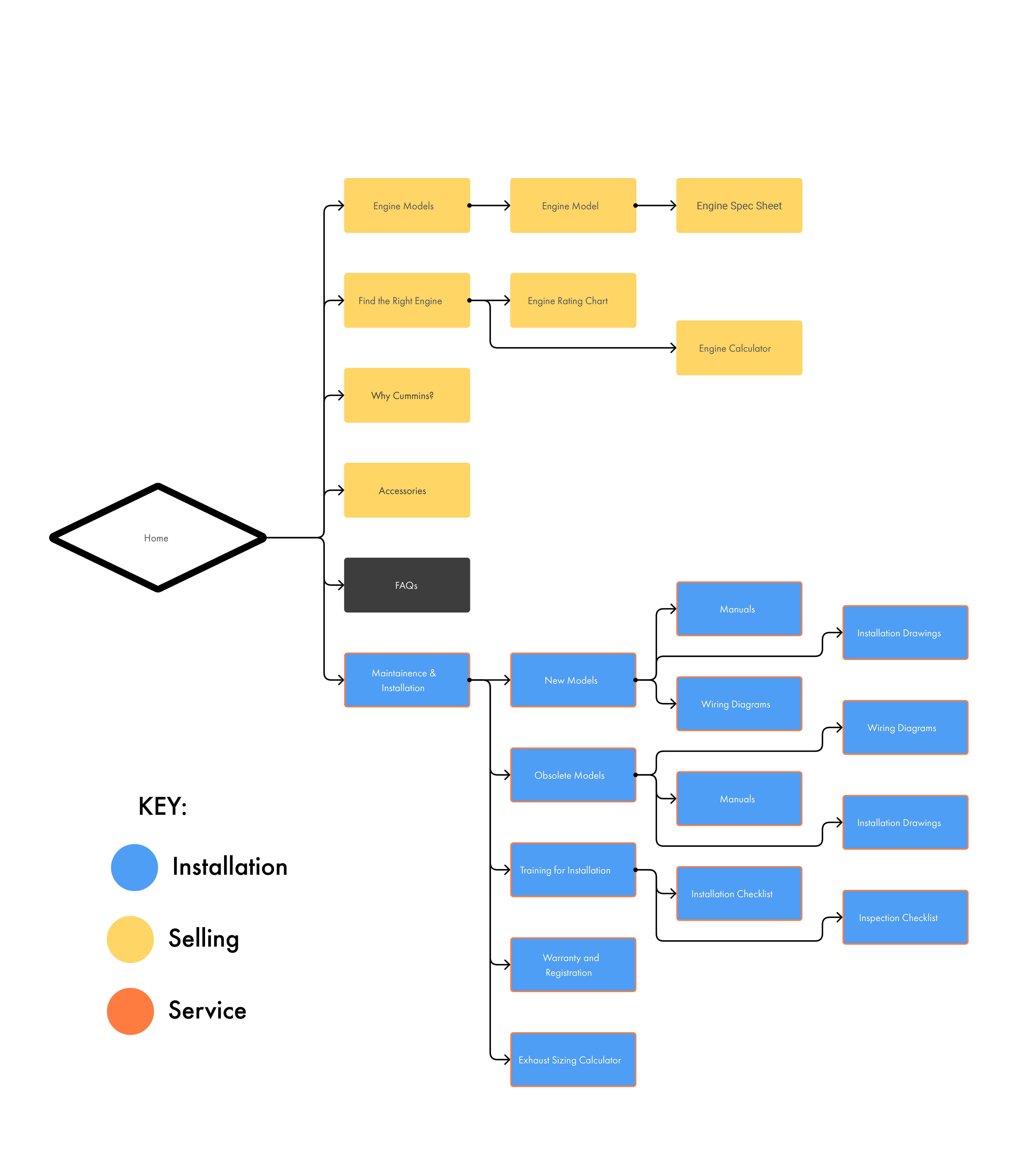
Revised site map for new Cummins site.
Validation
Stakeholder Feedback
Stakeholders definitely liked that the new site was simpler and more organized by user type. There were a few things on which they were not willing to budge; the internal users found a lot of value in the ratings charts that explained what engine would work depending on the rating of the pump and they wanted to include the engine calculator. As an external user, these items felt redundant, but alas I found a way to incorporate them into the website. In further discussions, I discovered the unsightly table was actually key in determining which engine to pick up front. I think to this day still a user has not used the engine calculator.
Rating Charts
Internal users were unwilling to budge on the 4 rating charts listed in the left-hand navigation. Although this was displayed on the public website, they needed it as an internal resource tool and could not reliably host it on an internal server.
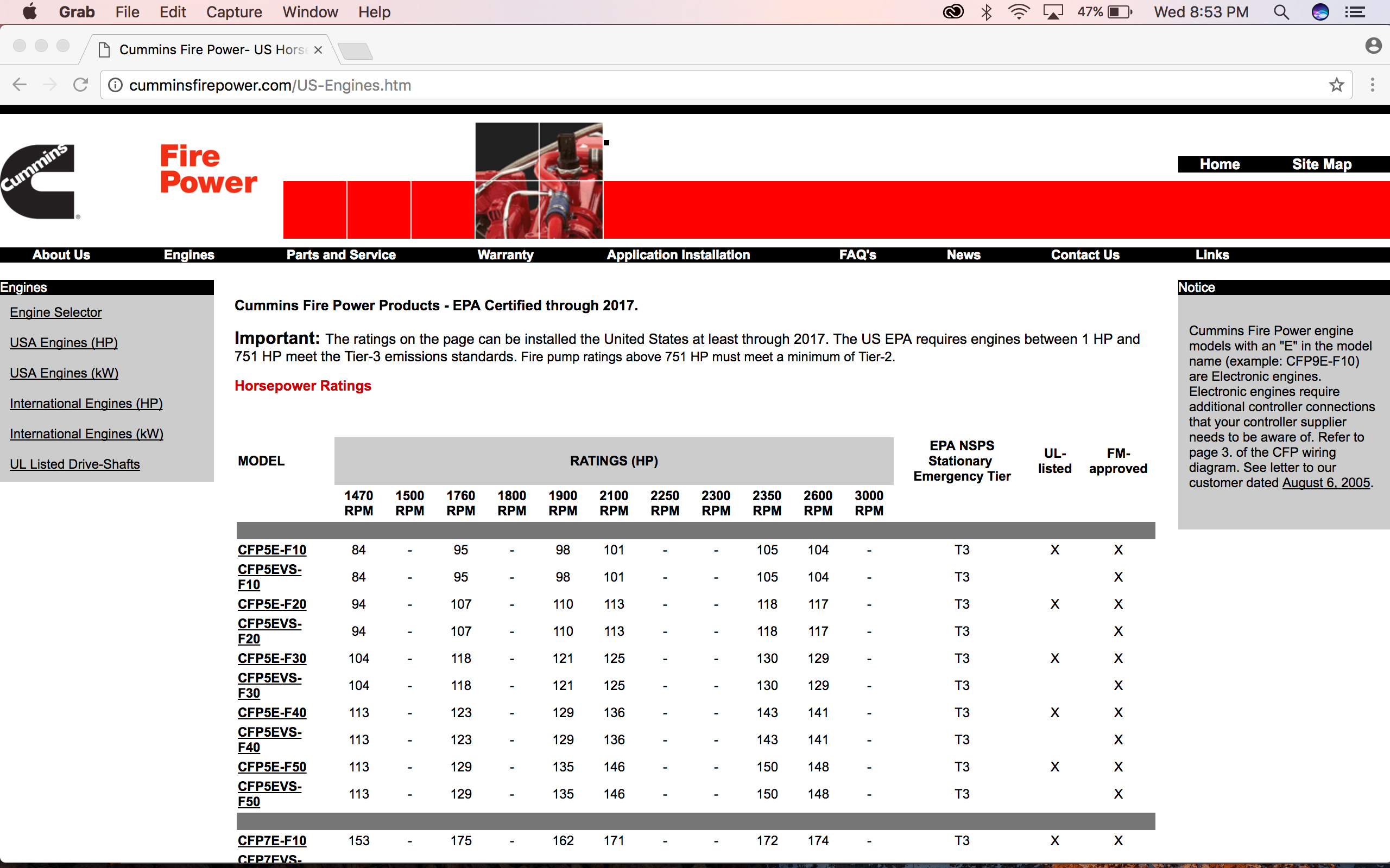
Antiquated UI for four rating charts that needed to be transferred over.
Engine Calculator
They also wanted to keep the engine calculator. As I was running out of time and the code used to build this was out of my wheelhouse, I chose not to fight them on this. They could re-evaluate in the future whether this feature was necessary.
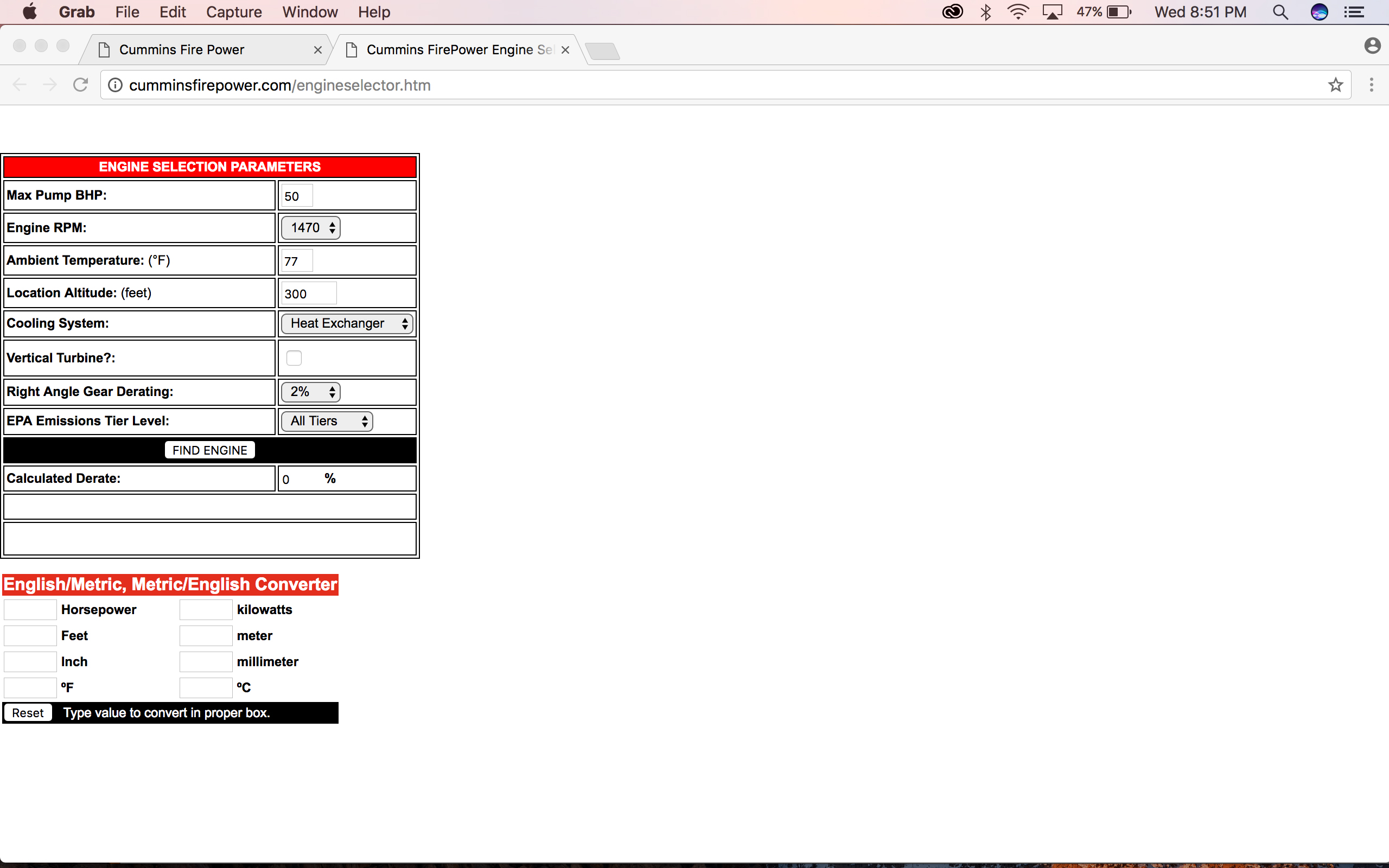
Antiquated UI for engine calculator that needed to be translated to the new site.
Deliverables
Low Fidelity Prototype
Since I worked on this for only a month, I managed to get the framework of the pages done. The client wanted to iterate on page copy and photos after I was gone, and they requested I use a prototyping tool they were familiar so they could continue to edit after I left. Surprisingly, I was able to create a comparable prototype in Excel by linking cells together, changing cell color, and inserting photos. This was a tool they were able to use after I left.
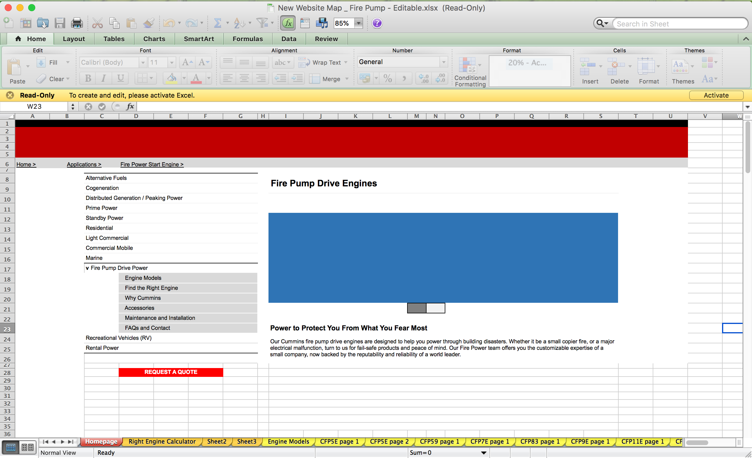
New low fidelity prototype built in Excel.
New Home Page
New site homepage. The blue box represents an image they would choose later on.
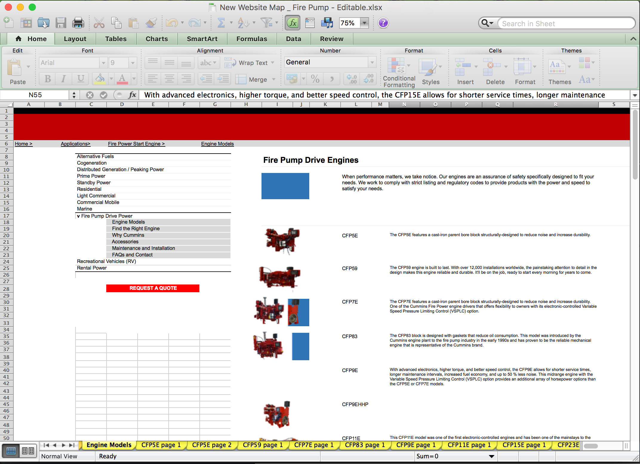
New low fidelity prototype built in Excel.
New Rating Chart
New rating chart. The charts were combined to include both “International Engines” and “US Engines” since, a) this engines are not referred to in this way anywhere else on the site and b) it decreased the amount of charts needed from 4 to 2.
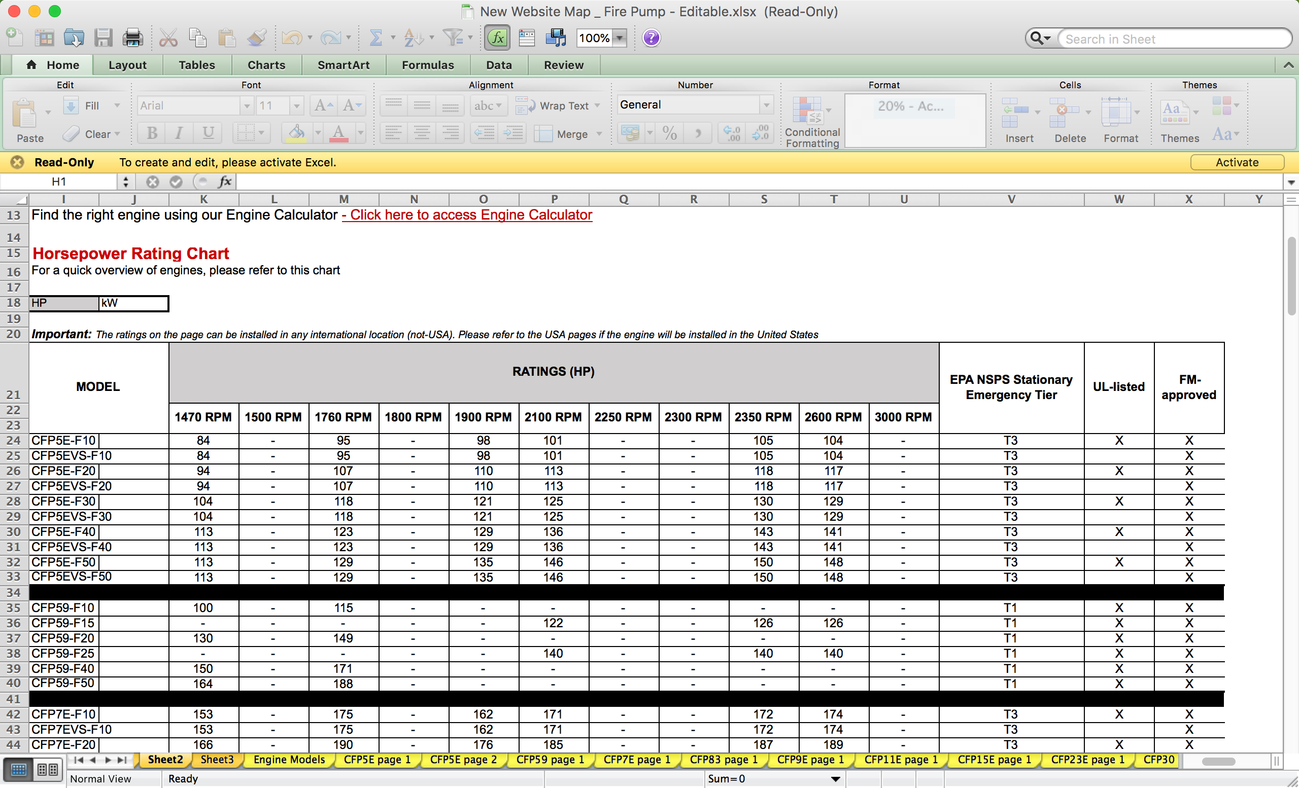
New low fidelity prototype built in Excel.