Flatfit App
Product adaption from mobile to desktop for Flatfit, a Barcelona-based start-up. Analyzed existing product market information and built the features from high-fidelity design to front-end development.
product-audit
user personas
user flows
high fidelity prototype
front-end development
Overview
Background
Flatfit App is a Barcelona-based startup aimed at pairing people with roommates to live with and places to live. Users fill out a survey about their preferences, such as cleanliness, personality, and habits. This survey is used to create an algorithm that shows a user’s percentage of compatibility with potential roommates, rooms, or entire apartments (flats).

Two Personas for Flatfit App.
Challenge
Flatfit needed help adapting their user flows from their iOS app to their website application. While the iOS app was in beta testing, the website app was currently in its first development release.
My Role
I worked to address problems with the app and address them in the web version. I created high fidelity mockups for the developers, and even coded an interactive prototype to pass off to them.
Discovery
Usability testing with iOS
Because Flatift was covering a lot of ground in the housing world, there were two distinct personas that emerged, a third persona, and also opportunity for one user to take on several personas at once. The app asked the user to self-identify upfront. However, this meant the person would have to restart their search if they wanted to change personas.
Example of the problem a 3rd persona would run into: how can I access the app if I do not self-identify?
Synthesis
User Personas
The main issue with the iOS version is it required users to conduct a search before being able to explore the app. The onboarding involved a length survey that asked a lot of questions about living-related habits. Without being able to use the app first, it was unclear what the questions were for.

Potential Roommate
Potential roommate is who the app is built for. He is most interested in the social aspect of the app and could be looking for roommates to move in with or a roommate that is already living somewhere and has an available room.

Potential Landlord
Potential landlord is the secondary persona. She is looking to lease her available room or flat. Her reasons might be that this is her full time profession, or she may be looking to move out with her roommates together. She doesn’t care if the people renting her flat are compatible with her.

Potential Tenant
Potential tenant is our supplmentary persona. He is similar to the potential landlord, but his motives are different. He cares about the compatibility of someone moving into the room he posts. He might also be posting his own room to move to a new place, so he overlaps with Potential Roommate.
User Flows
To address user complaints that they had to go through the onboarding before viewing the app, this flow was eliminated in the website version. However, this meant the pages would look a little different. Without self-selecting an experience upfront, users would have access to listings without ever having published anything and favorites without looking for a roommate or room to live in. What would this look like for each user?
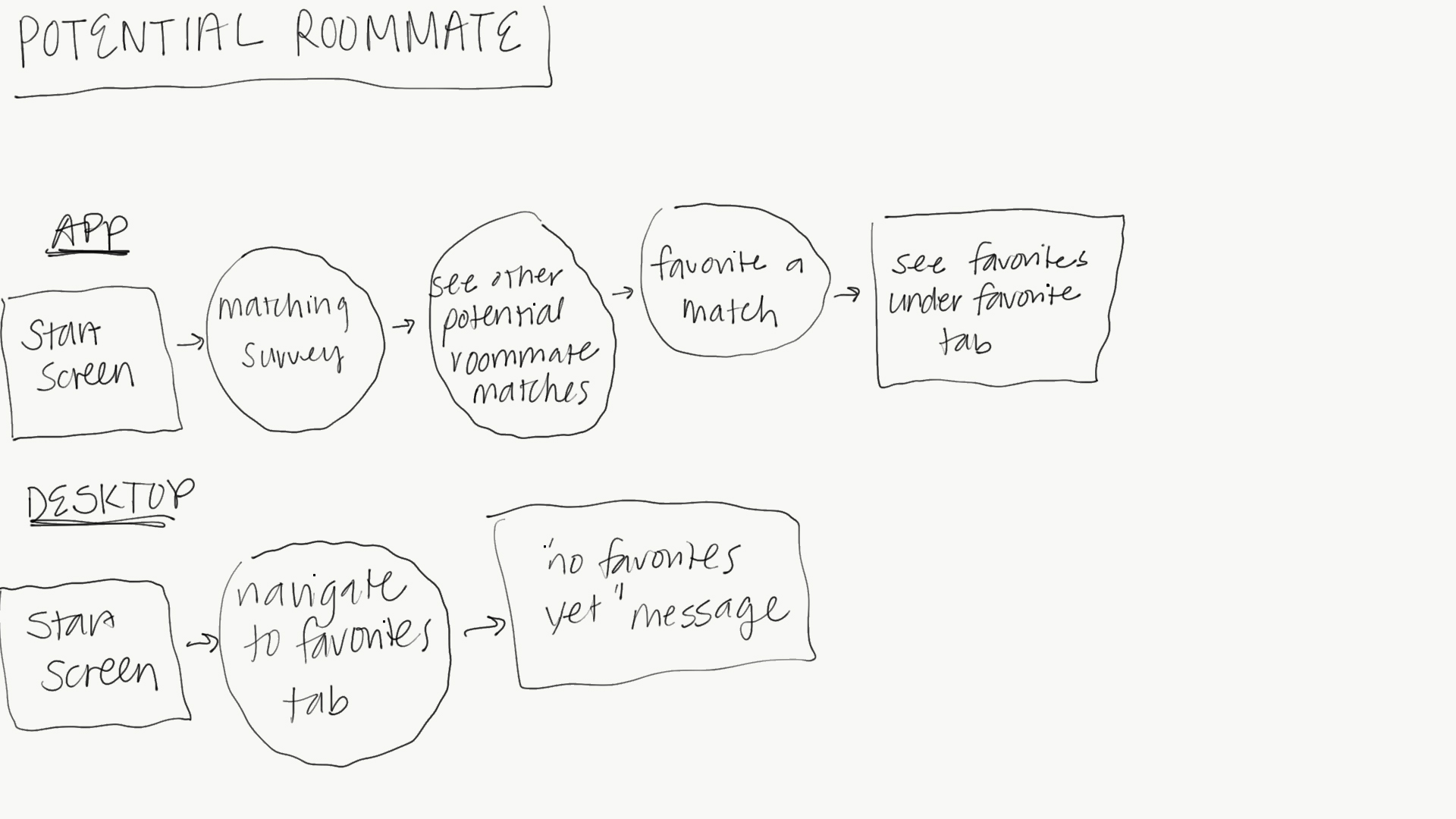
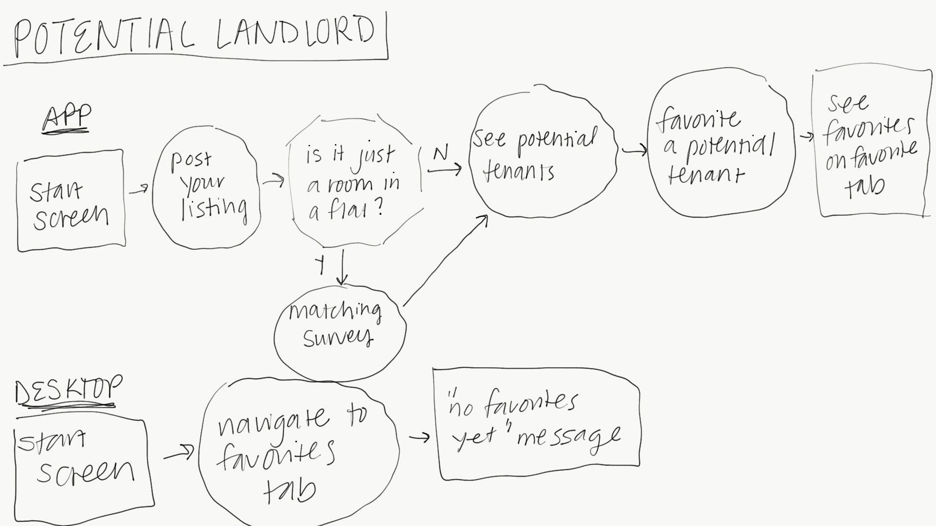
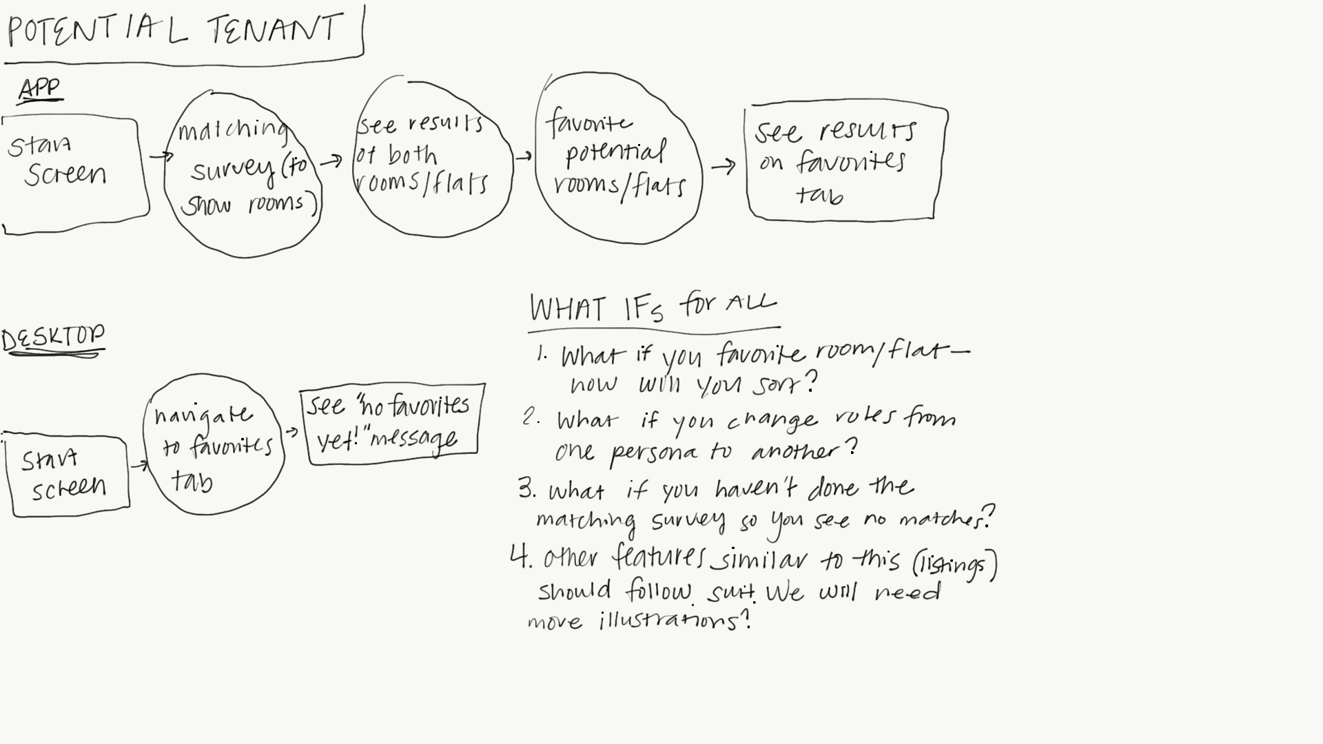
Hand drawn user flows of the potential roommate, landlord, and tenant.
Ideation
High-fidelity prototype
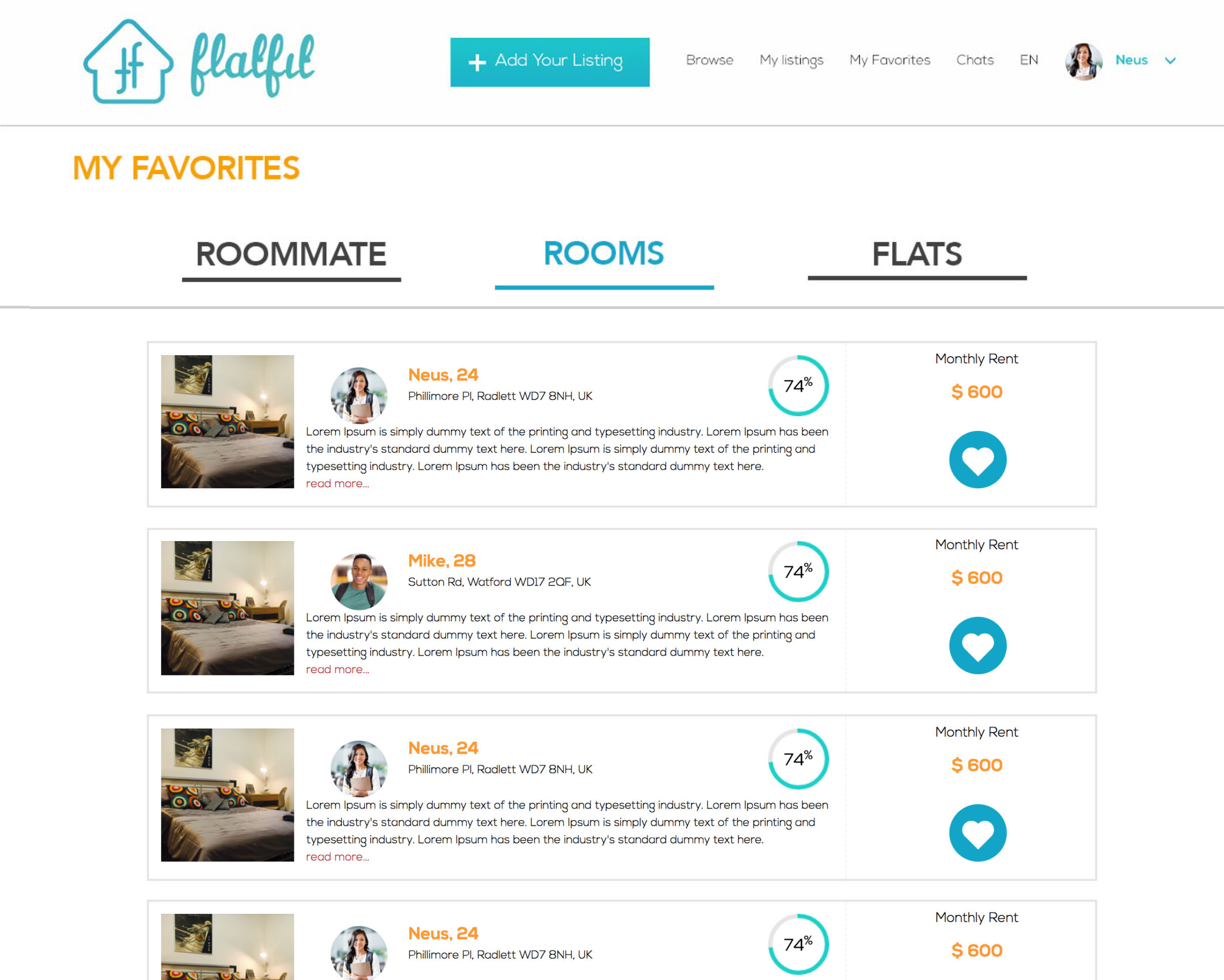
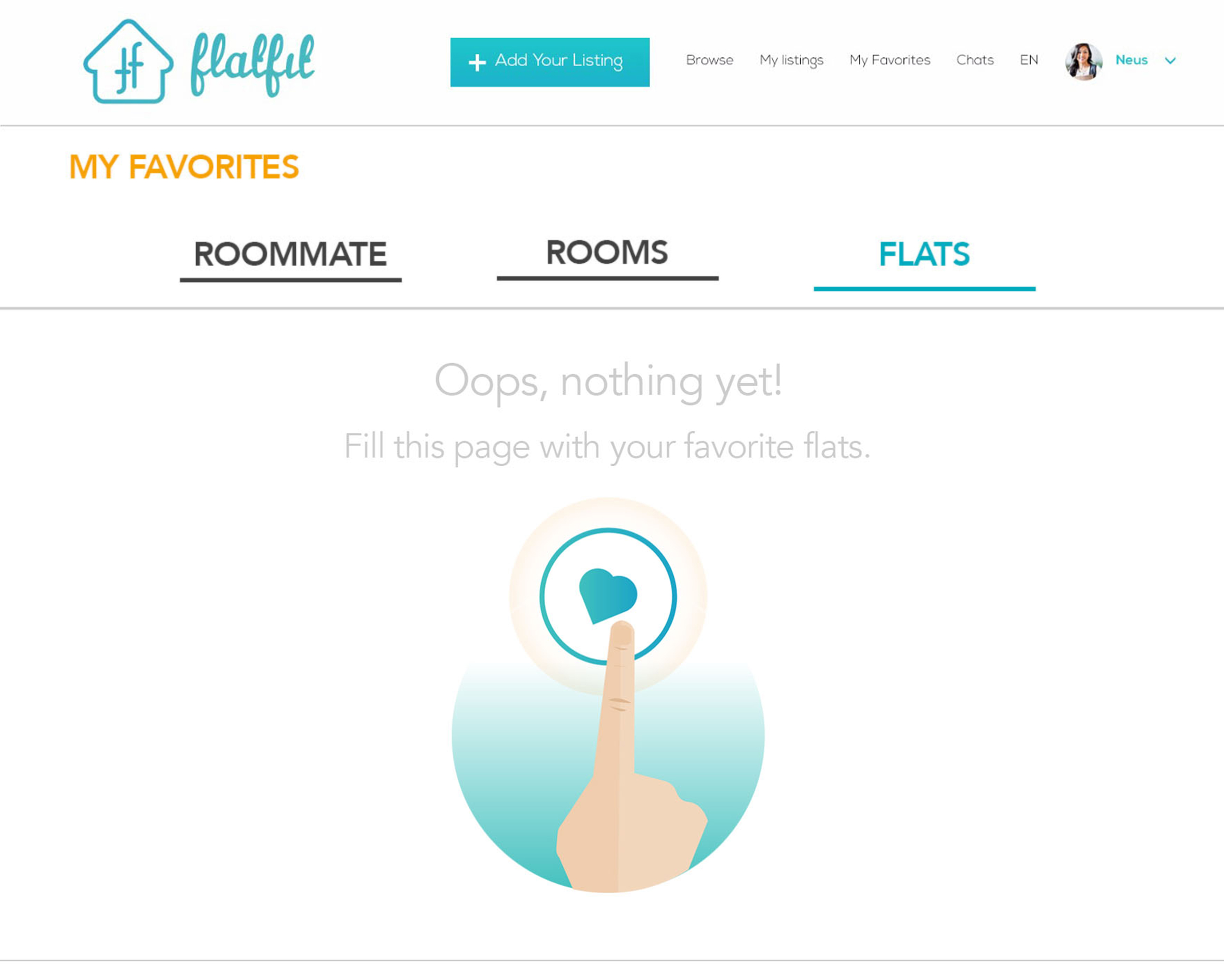
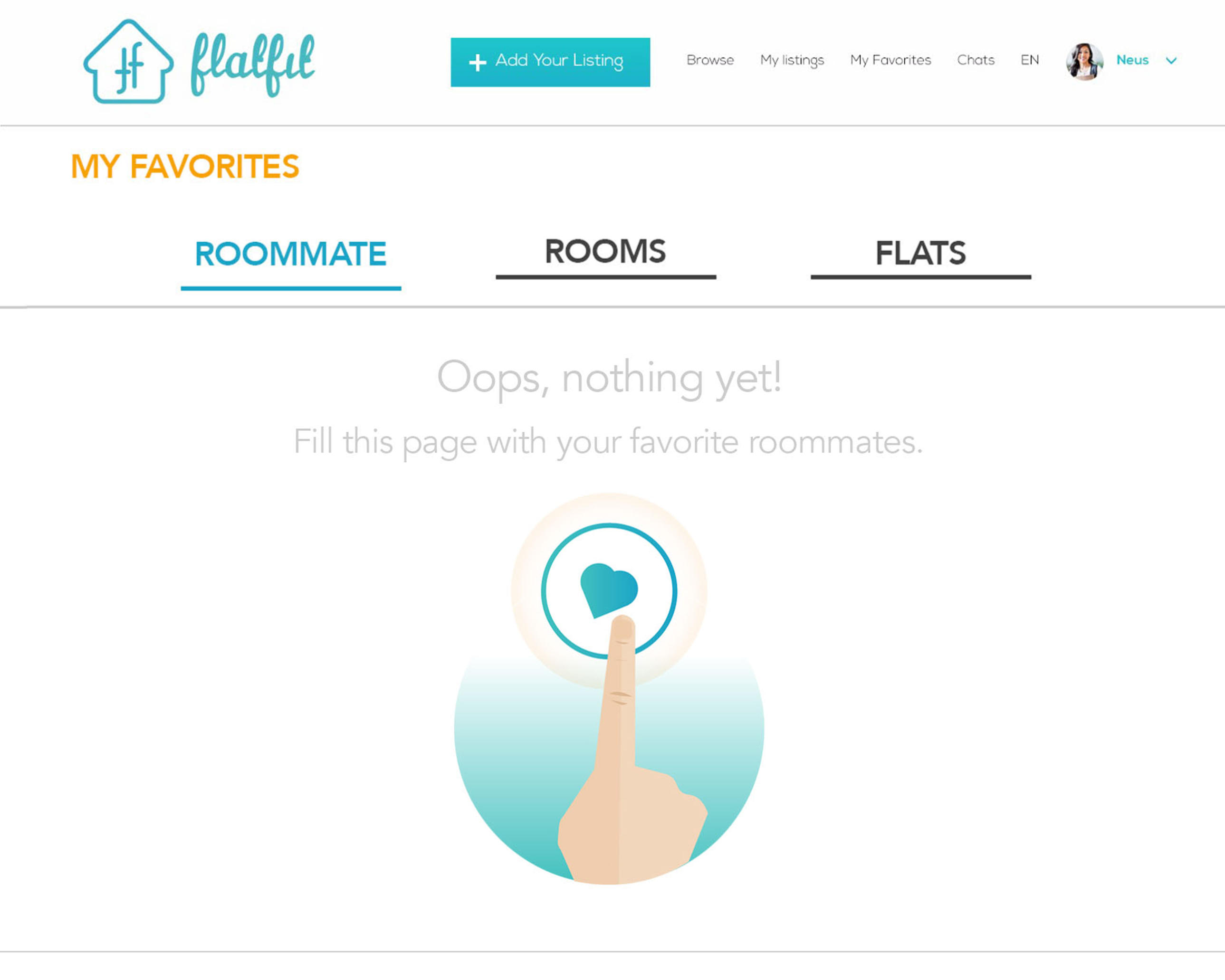
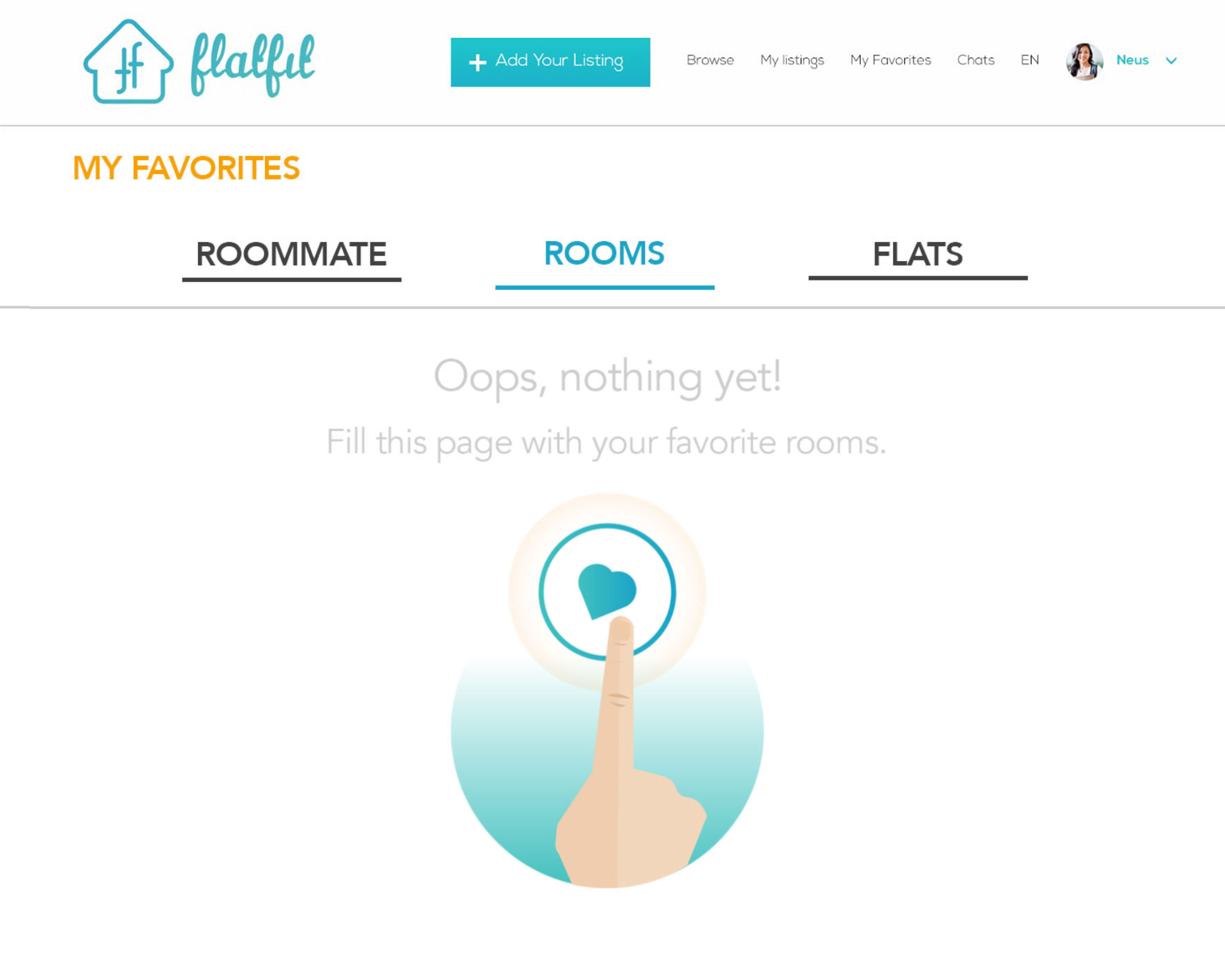
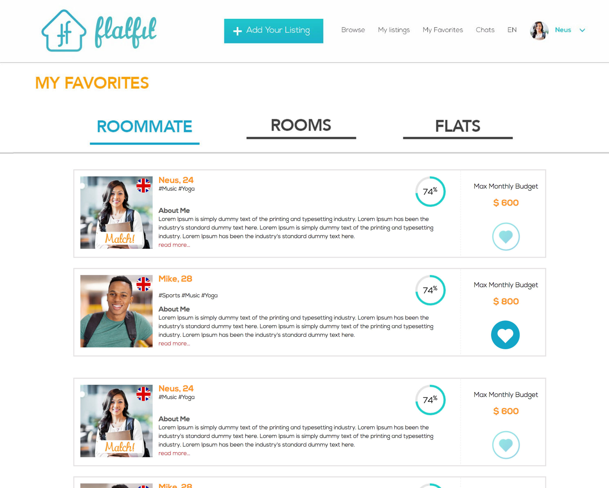
I passed a coded prototype to the developers to work with. Users saw cute illustrations that hinted at what they would need to do to get content to appear on that page. This provided a gentler version of previous onboarding experience. Users could try out and explore the app, but also be nudged toward a solution.
Potential Roommate
Potential Landlord


Potential Tenant


Website user flows of the potential roommate, landlord, and tenant.