Global CI
Rebuilt & Rebranded a Health IT consultancy company’s website. Created a design system, conducted stakeholder research, and rebuilt the website in Wordpress.
product-audit
competitive-analysis
card-sorting
information-architecture
heuristic-analysis
high-fidelity-mockup
Overview
Background
Through my network I connected to Global CI, an IT consultancy, who felt their current website portrayed their company as a “staffing agency” and were looking for a revamp. They also had recently launched a new logo for their company and wanted to refresh their branding to match.
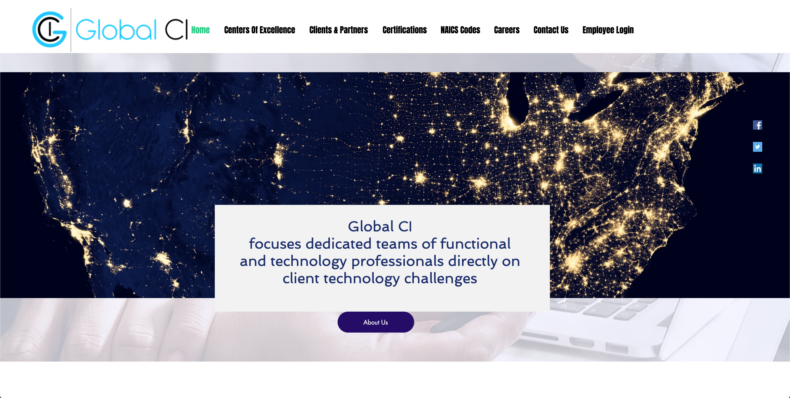
Existing Global CI Website
Challenge
Global CI struggled to communicate their offerings to their customers through content, website layout, and downloadable assets. This meant their website was drawing minimum traffic and not being utilitized as a business generator. Without a dedicated UX team (or web manager, product owner, etc), they needed outside help to accomplish this.
My Role
I worked to synthesize the CEO’s ideas of his company into a viable prototype, test content engagement with users, and refine the website based on feedback.
Discovery
Current Website Audit
Looking beyond the inconsistencies in the user interface (varying type faces, display issues on smaller browser sizes, spacing, etc), I wanted to know how users were currently finding the site, how they were interacting with it, and how the content is set up. What I found was that most searches were direct from a desktop, and nearly 2/3 of users left immediately. There were three main pages and the 8 tabs of high level navigation linked to anchors among the three pages.
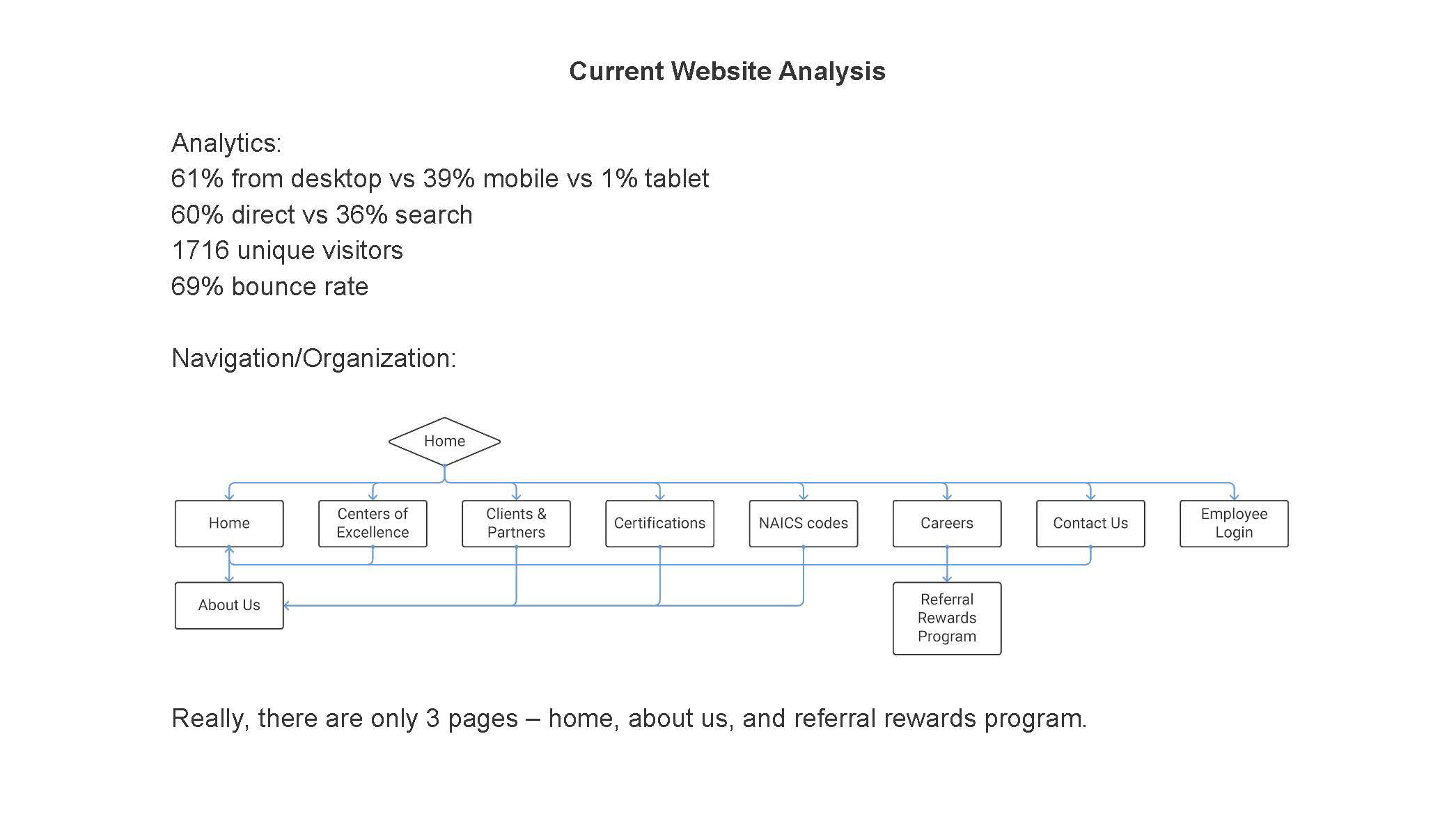
Current website Information Architecture Analysis and Conversion Stats.
Competitive Analysis
I looked at 6 companies identified by the client as key competitors. Since I inherited this project from another designer, I already had information on color schemes, page set ups, and tones of the sites. The analysis left is what I presented to the CEO as a condensed version of my research. It highlighted how competitors did some of the things on the client’s wishlist along with other main sections we needed to be competitive.
Current Website & Competitors Analysis
Card sorting activity
I had the client come up with what he felt needed to be on the site (a list of 35 items). Using Optimal Workshop, we sent out a card sorting activity to team members, established clients, and other stakeholders. The 35 cards were created by the CEO and the categories were inspired by the most popular categories from the 6 competitor sites (home page, company, services/products, resources, and a ‘trash’ option if they felt it didn’t belong). Participants could also create their own categories.
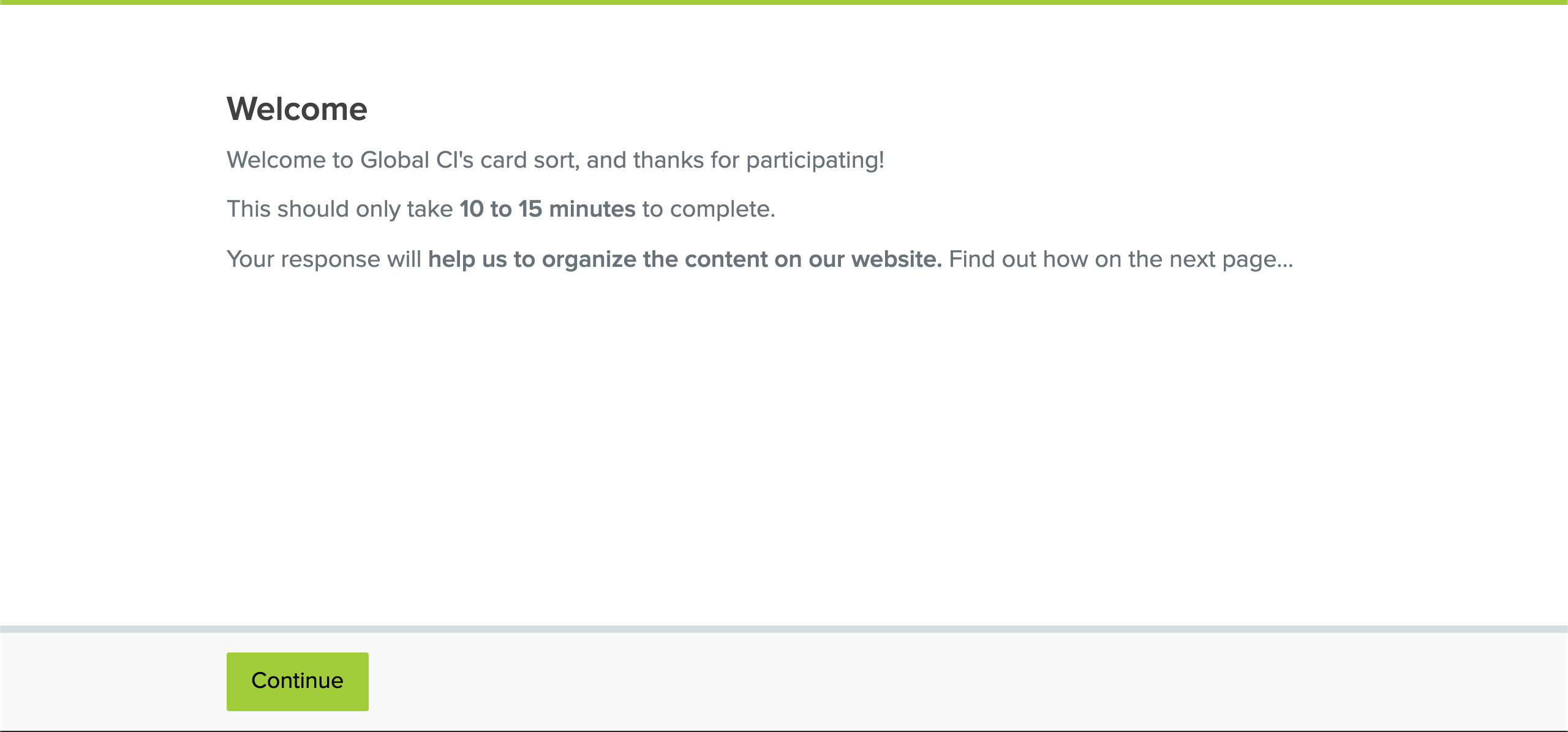
Card sorting activity with internal stakeholders, proctored through Optimal Workshop.
Synthesis
User Personas
Initially, I wasn’t planning to do user personas because this is a landing page site for a company. However, the client brought up the idea since Healthcare, Government, and Commercial users might be looking for different information. I worked to create detailed personas and revised them based on client feedback. We used these personas to rationalize decisions we made that weren’t informed by the card-sorting.
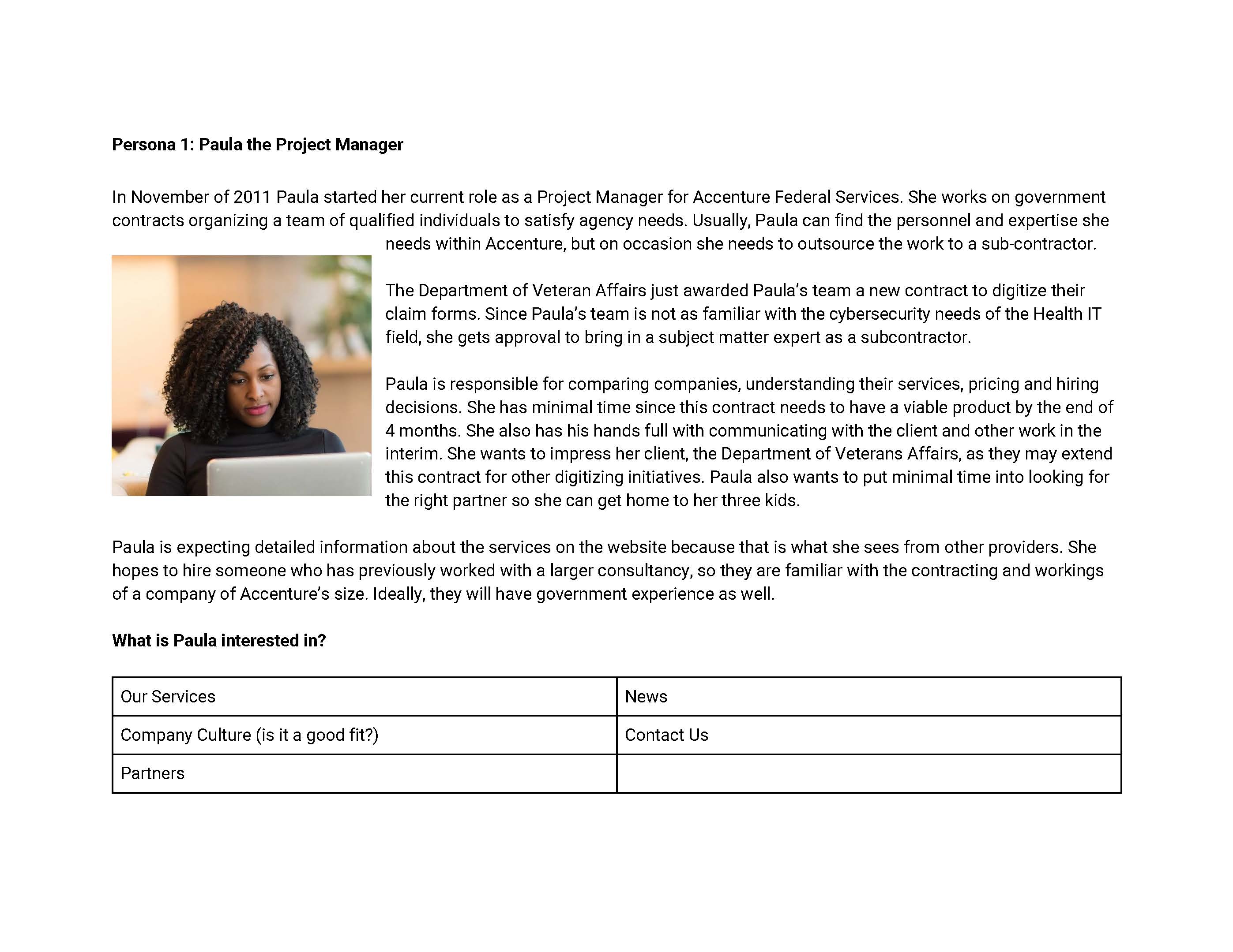
Personas of site visitors.
Ideation
Wireframes
After presenting the card-sorting results to the client, I created a wireframe to show how the content would be laid out on the pages and how they might interact with one another (links from the home page to the who we are page).
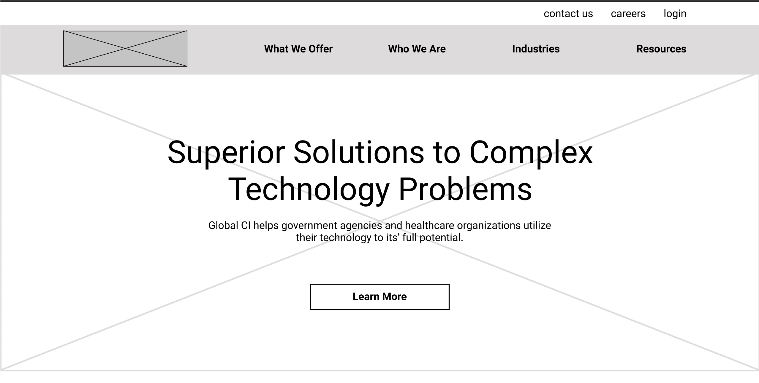
Low fidelity wireframes.
Content Building
According to the contract, the client was responsible for the content. In order to collaborate with their SMEs most efficiently, I recreated the wireframe pages in an editable google document. They could still see the style and placement of the content, but edit it easily and collaboratively.
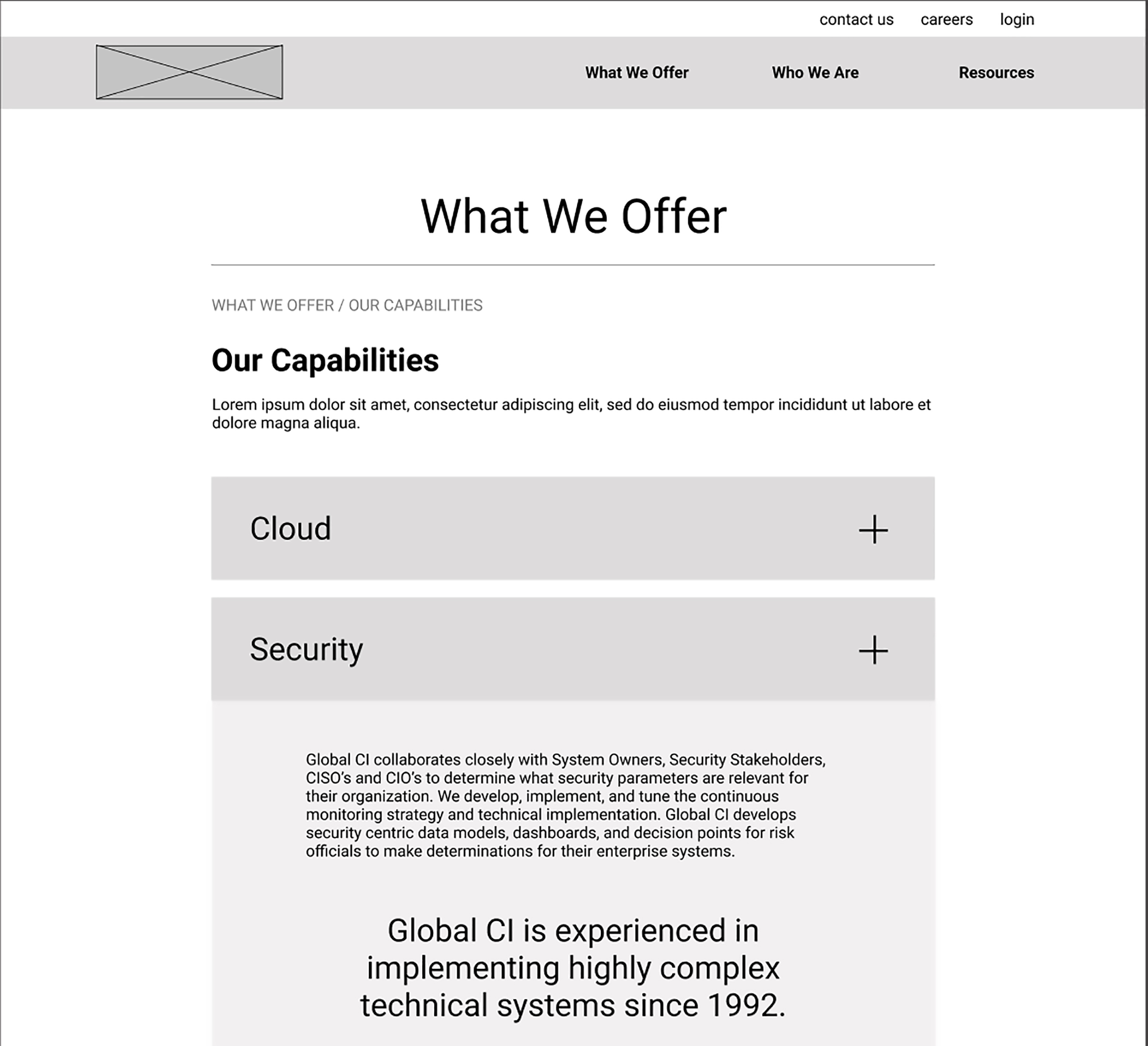
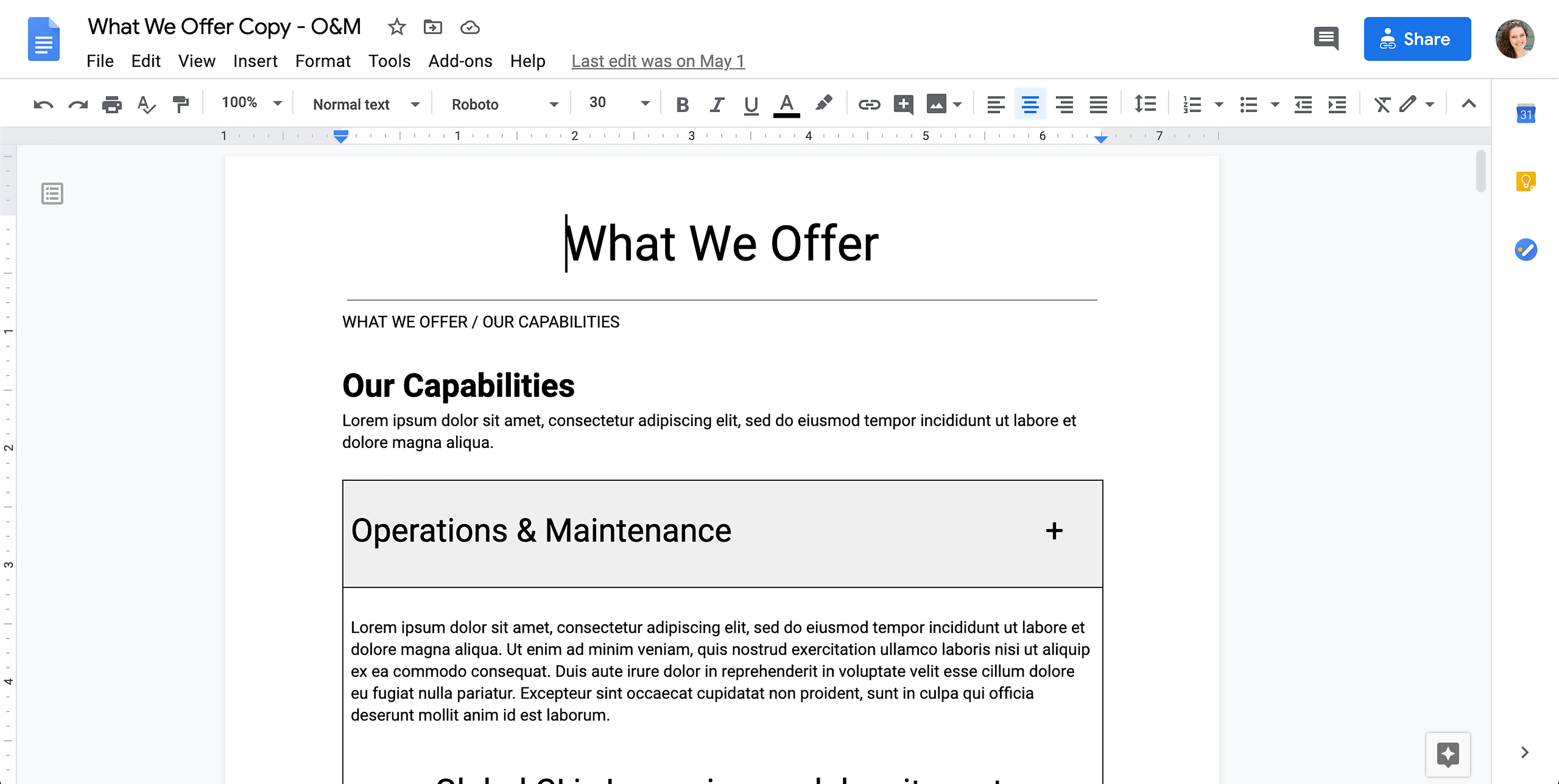
Mid fidelity wireframes and matching word docs so that stakeholders can edit and input content.
Branding Options
As part of this site build included a new interface look, I created three look and feels for the client to select from. There were options for fonts, colors, and buttons. They chose one of each to create a new look for the site.
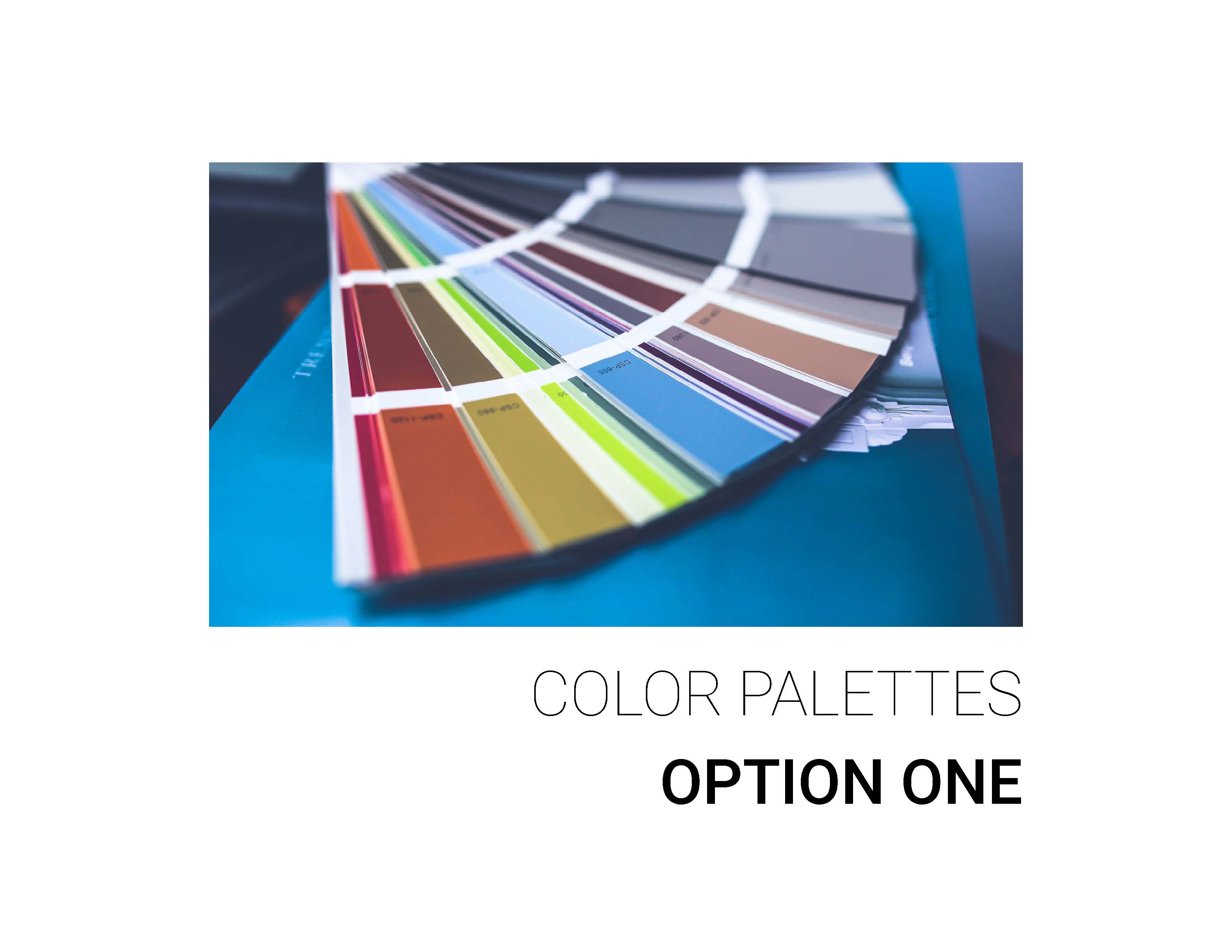
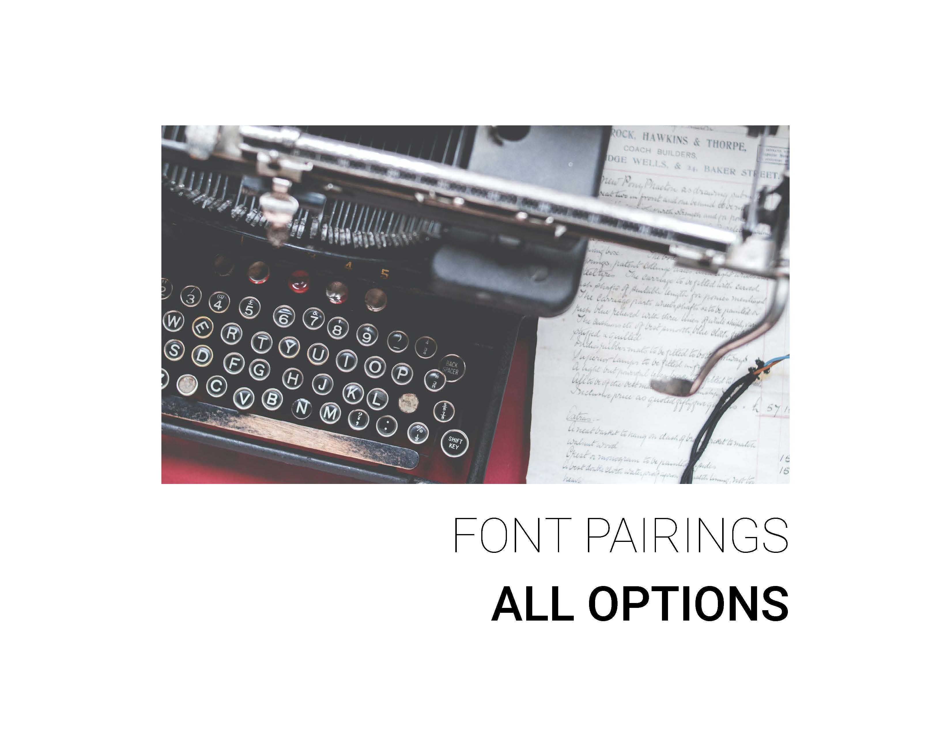
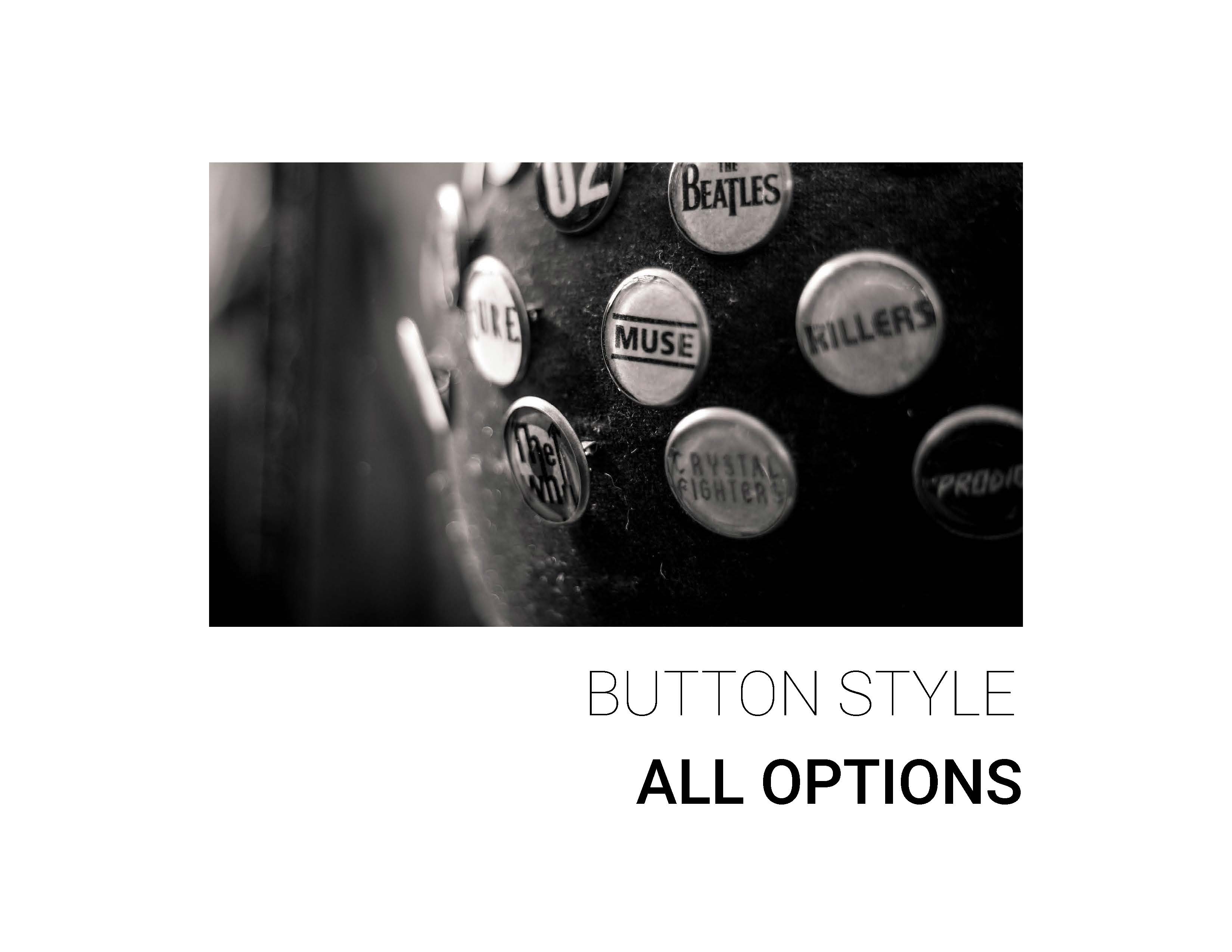
Client decks to choose colors, fonts, and button styles.
Discovery & Synthesis Phase Two
More Personas
Halfway through this project Global CI finalized the acquisition of MMY consulting, a more Health IT centered consultancy. This added three more stakeholders. To get them involved, we re-addressed the existing personas and added some that were more health-focused.
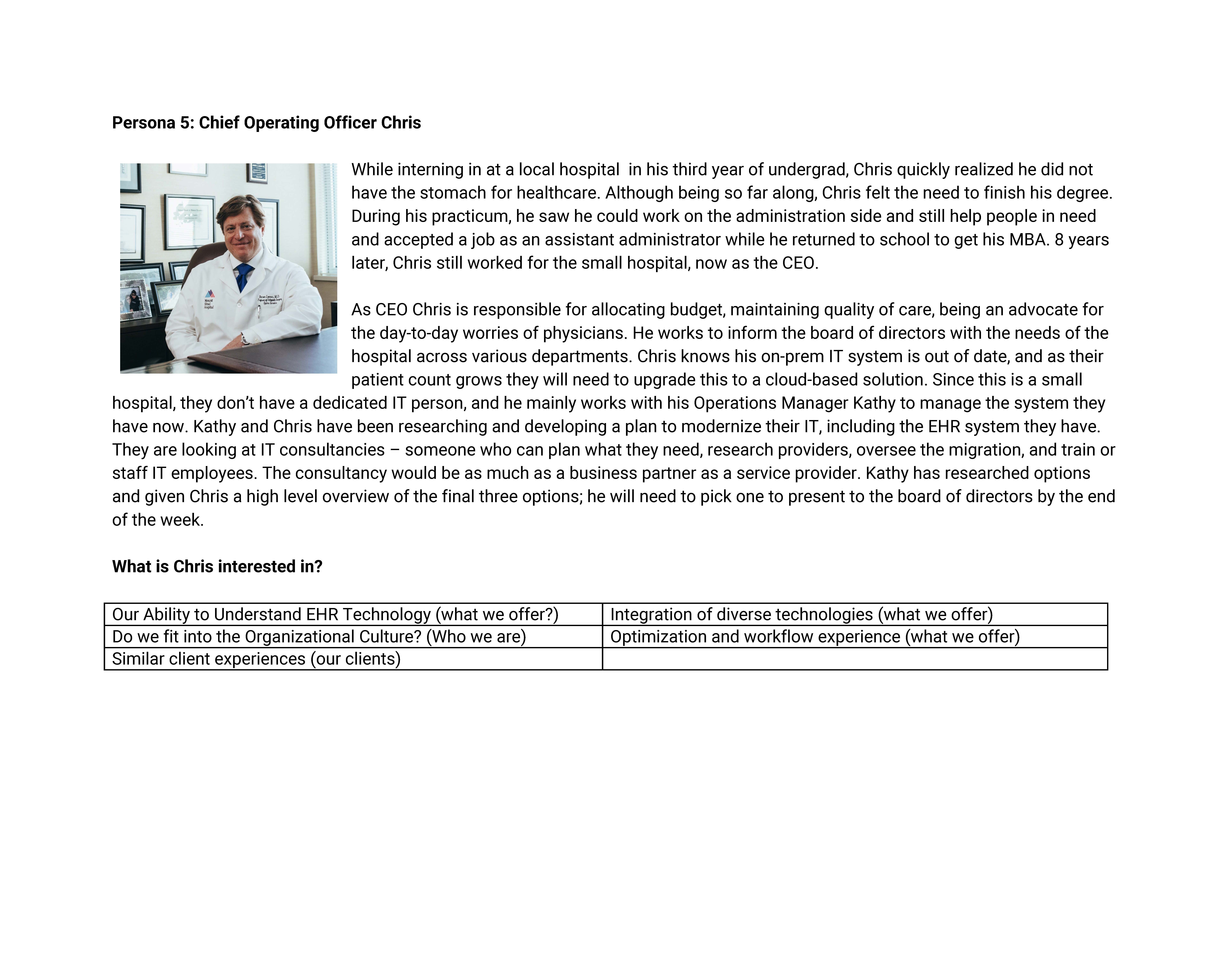
Additional persona of Chief Operating Officer Chris.
More Competitive Analysis
While reviewing the inital wireframe layout for the “What We Offer” page, we realized we needed a different approach to be able to tailor general capabilities (ex. Cloud Migration) to specific industries (ex. Cloud Migration with patient data in a healthcare setting). How were others addressing this? I went through three new sites: Leidos, CTG, and Centric to analyze how they incorporated the capabilities they had with the industries they served.
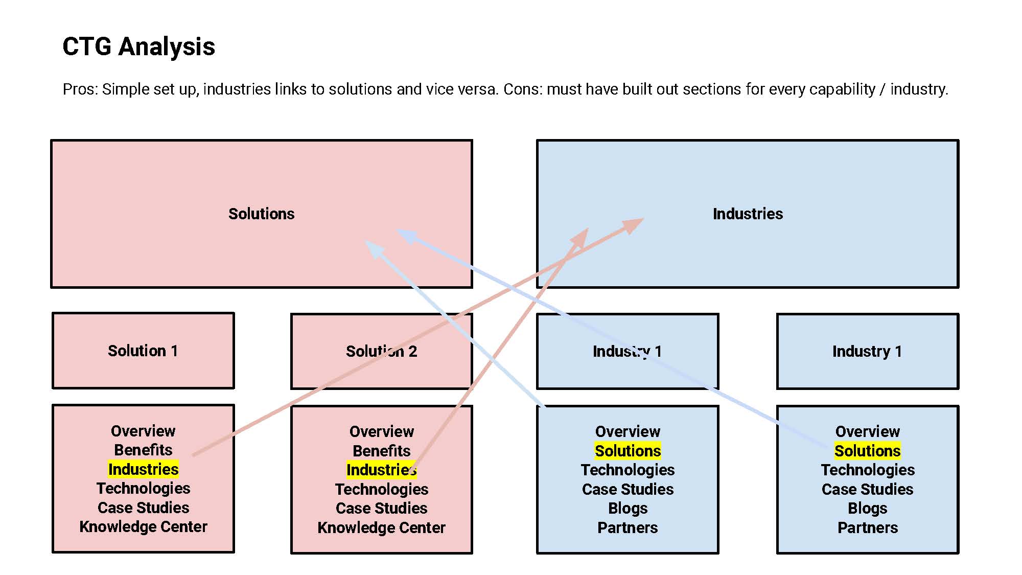
Solution to crosslink industries and solutions.
Ideation & Publish
High-Fidelity Mockup
Being that our timeline was end of May to launch, I decided to move forward with the design of the site while stakeholders worked on content. At this point, we had nearly finalized the layout and were waiting for content to be written. I created a high-fidelity wireframe using Figma and shared it with stakeholders.
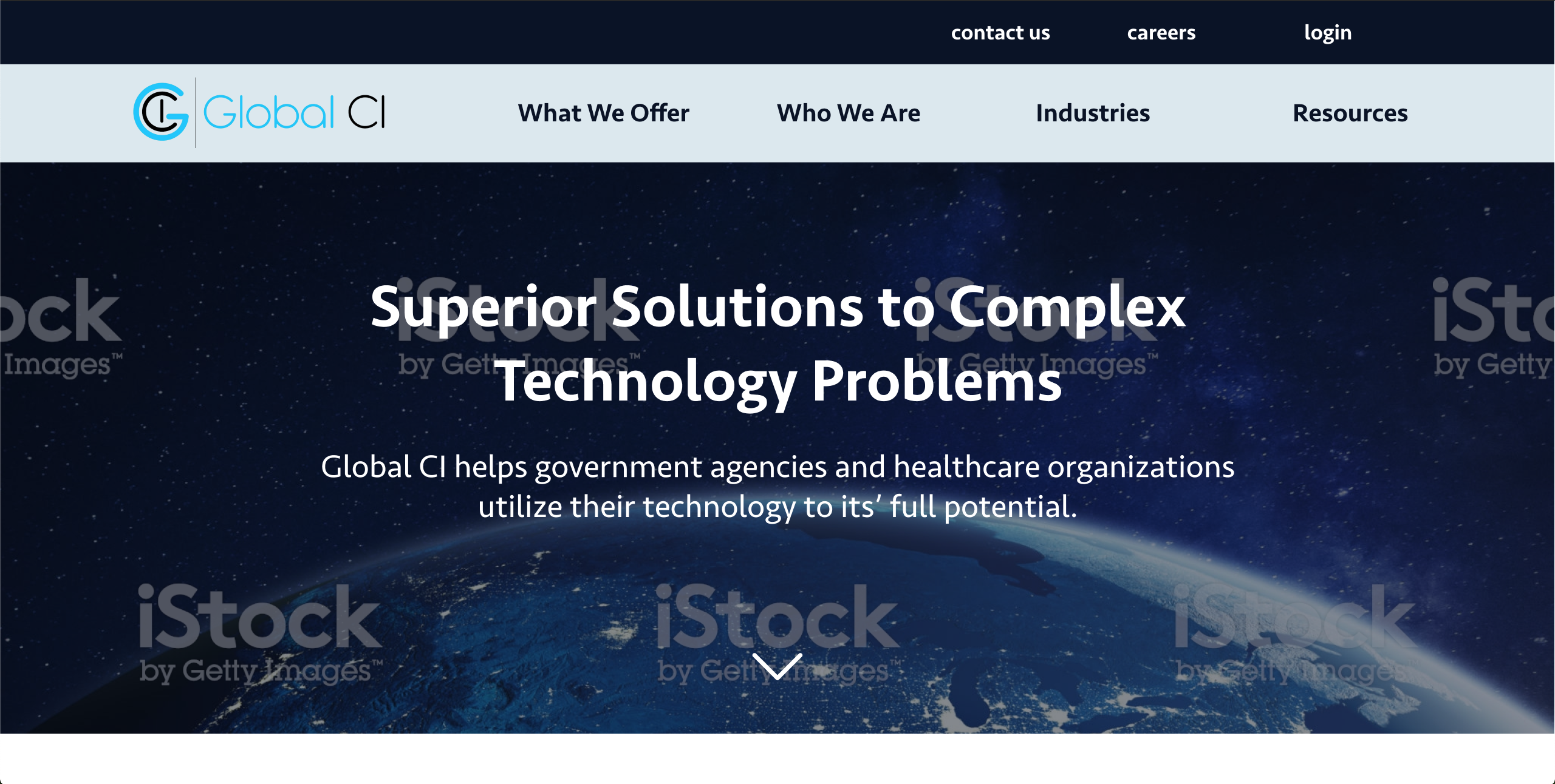
High fidelity mock up for client review.
I built the website out in Wordpress using plugins. Additionally, we set up a redirect from MMY to Global CI with an explanation of the acquisition.