Humane Rescue Alliance
Improved existing foster volunteer program communications for Humane Rescue Alliance, a local animal rescue organization.
usability-tests
survey
service-design
user-interviews
competitive-analysis
product-refinement
Identifying a Problem
It was March 2020, and like every other American I decided it was the perfect time to begin fostering cats and dogs. I found Humane Rescue Alliance (HRA), the largest animal welfare organization in the DC area. After a quick application and approval, I was sent orientation emails and put into two foster Google Groups– one for cats and one for dogs. Almost immediately, my daily inbox spiked from my usually 1-2 emails to 15-20 from other foster parents.
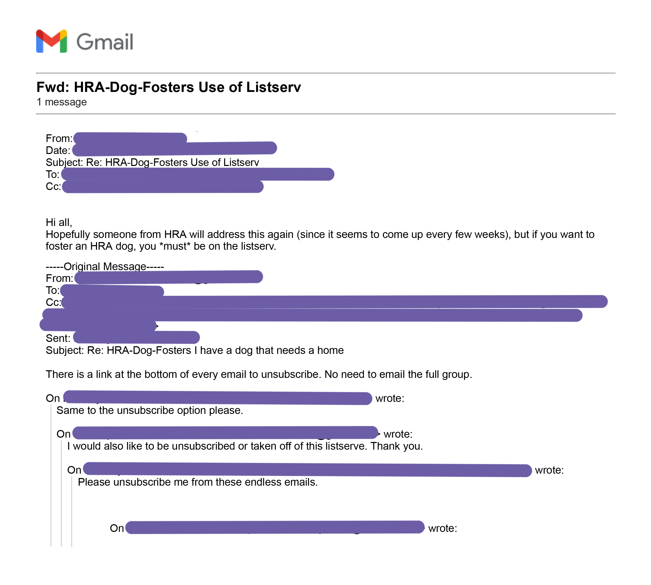
Example of a disgruntled group member responding to a long email chain.
I was overwhelmed, but I wasn’t alone. Other new foster parents voiced their concerns over the emails. There had to be a better way to communicate requests for foster pet supplies. I reached out to the foster program director to volunteer my ability as a UX designer. She told me in a normal month, HRA receives around 70 foster parent applications; however, in March of 2020, they had roughly 1,300 people volunteer to take care of animals. As a volunteer-based organization, she was thrilled at the offer for free help.
My Role & Contributors
As a foster myself, I identified these issues early on and volunteered my time as a UX designer. I reached out to the program director, and began my journey as a one-woman UX team. I conducted research, ideated test communities, and implemented the solution.
Exploratory Research
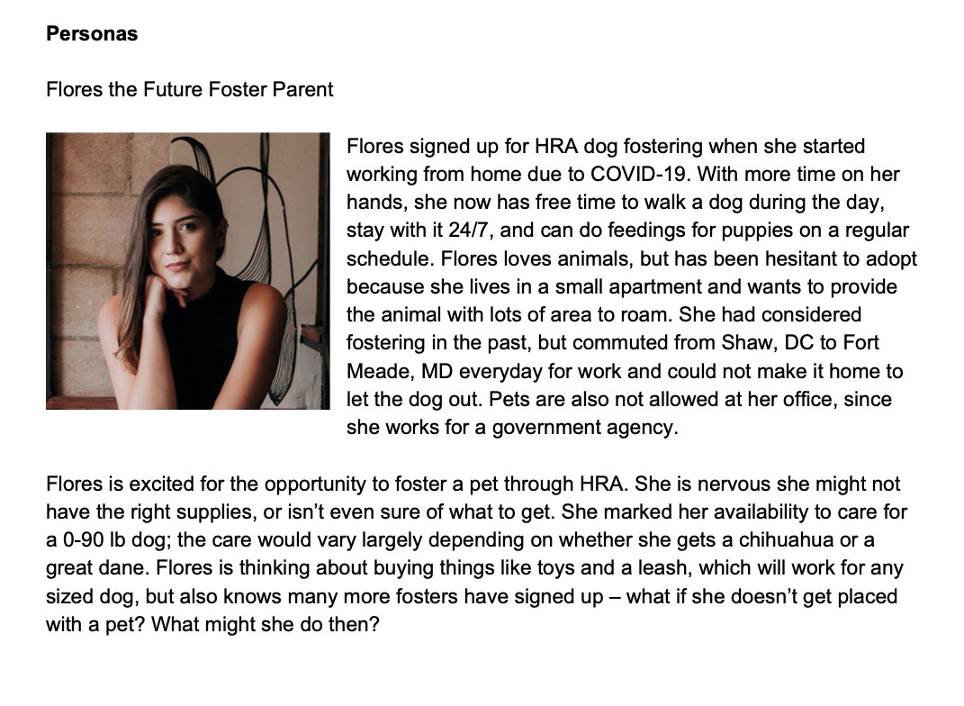
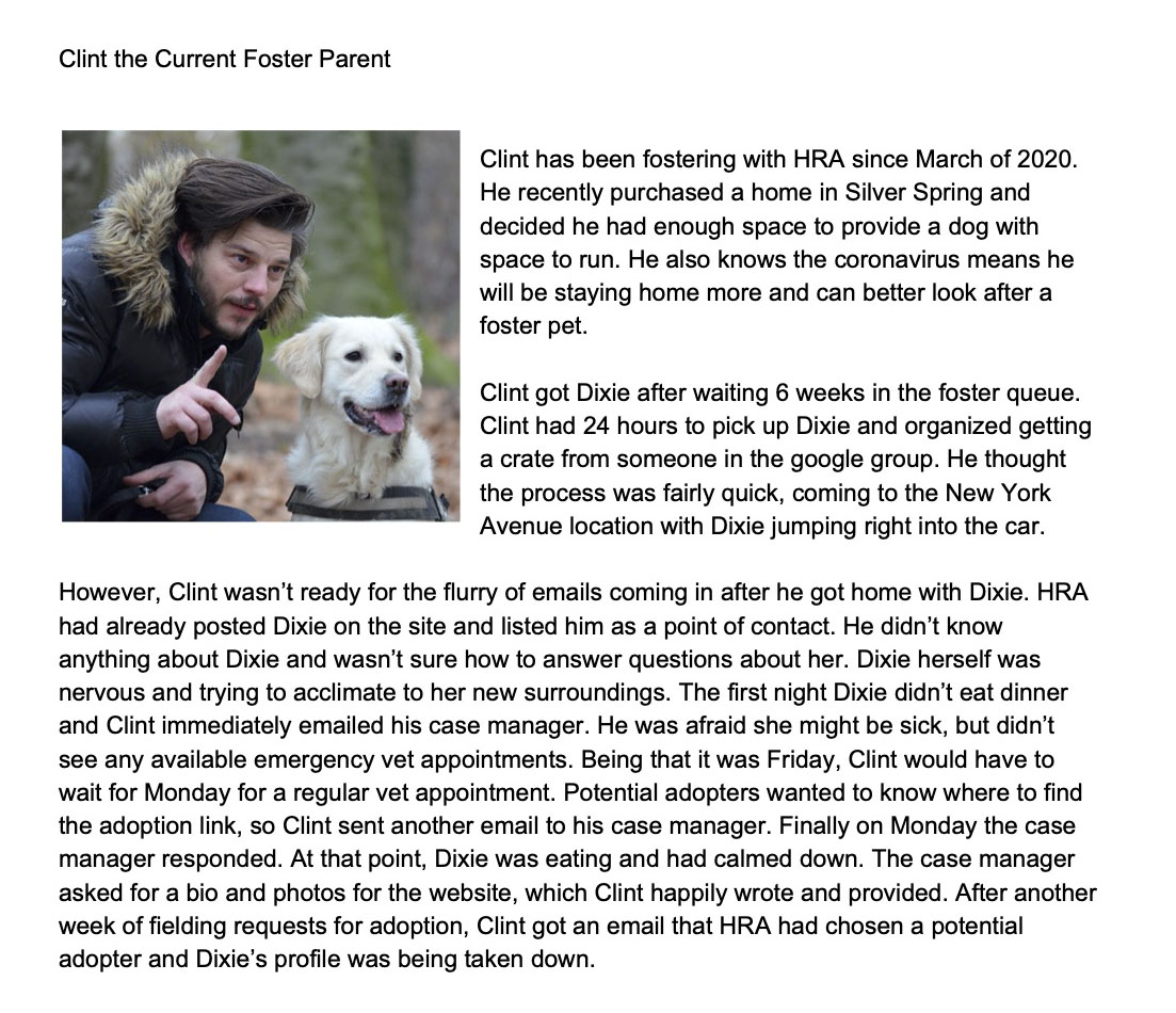
Proto-Personas
I created ‘proto-personas.’ Basically, ideas of who I thought were in the group and user types I wanted to interview. I noticed those asking for supplies usually mentioned they were first-time fosters, which is why they didn’t have these things prepared when they were matched with a pet. Those offering supplies were usually long-time foster parents, or those with resident pets who no longer needed the item they were giving away.
Proto-personas: Flores the Future Foster Parent and Clint the Current Foster Parent.
User Interviews
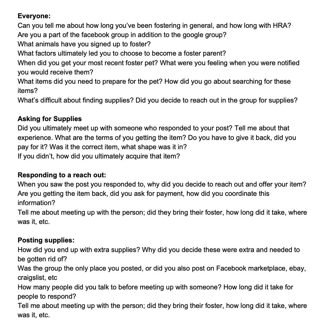
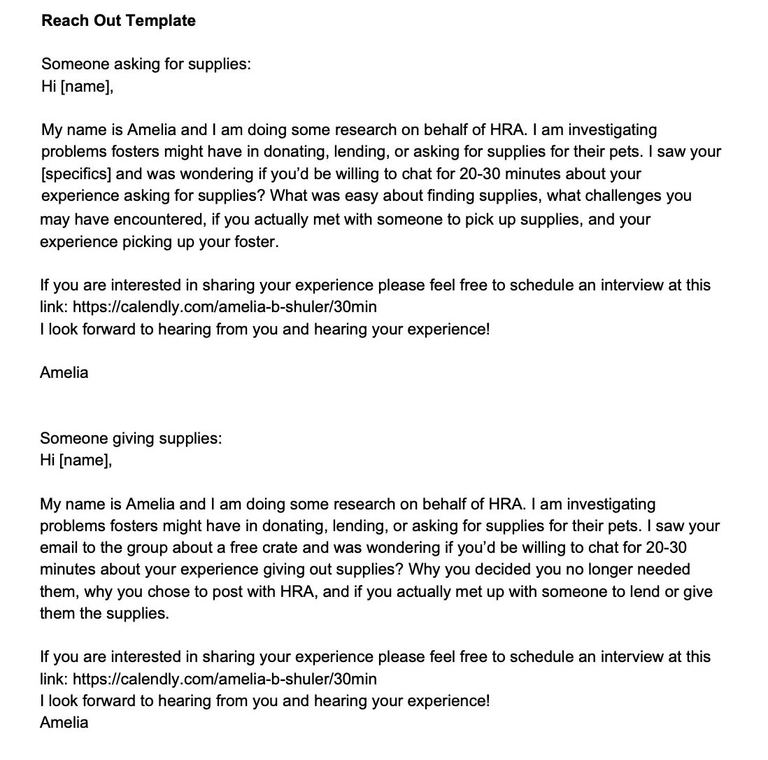
After identifying a business need and some potential user types, I created a discussion guide, research plan, and reach-out template.
Discussion guide (left) and Reach out template (right).
I conducted 13 half-hour interviews. I opted not to record because I had 2 interviews with technical difficulties that resulted in a phone call, 4 scheduled interviews that were a no-call no-show, and had reached out to 30+ fosters in order to schedule the 13. It was difficult enough to get people to talk– I didn’t feel comfortable also asking to record them.
I stopped interviewing when I felt I had covered all personas of users of the group: full-time fosters, ‘happy hour’ fosters (another program HRA offers), those offering to lend or give away items, those asking for items, cat fosters, dog fosters, first-time fosters, veteran fosters, tech-savvy fosters, and those who barely used email. I also stopped when I stopped hearing new information from fosters.
“I had 3-4 responses right away [when I reached out to ask for a litter box]. I got everything I needed in 24 hours.”
“I’m really okay with how the [supply sharing] is organized, I just get too many emails. Maybe make a separate group for supplies?"
“I missed a lot of emails with important links in them… I had to go back and look for them.”
“It was really hit or miss with the case manager. By the time he responded the issue we had was already resolved.”
“I see a lot of people asking [the same questions] in the group: how do I update my on-deck? When will I get matched? What do I do when this happens? etc."
To be a foster you were required to be a part of the google group. HRA staff sent out weekly informational emails with important links and information through the group. However, there was no way to unsubscribe from foster parent emails and still receive the announcements.
After bringing the concerns to the program director, we established some requirements for a platform:
Survey
A concern the program director had was that some fosters in the DC area had government-facing jobs that restricted their use of social media. To research a larger group and get feedback on some of the platforms mentioned in the initial interviews, we sent out a survey to ask a combination of qualitative and quantitative questions.
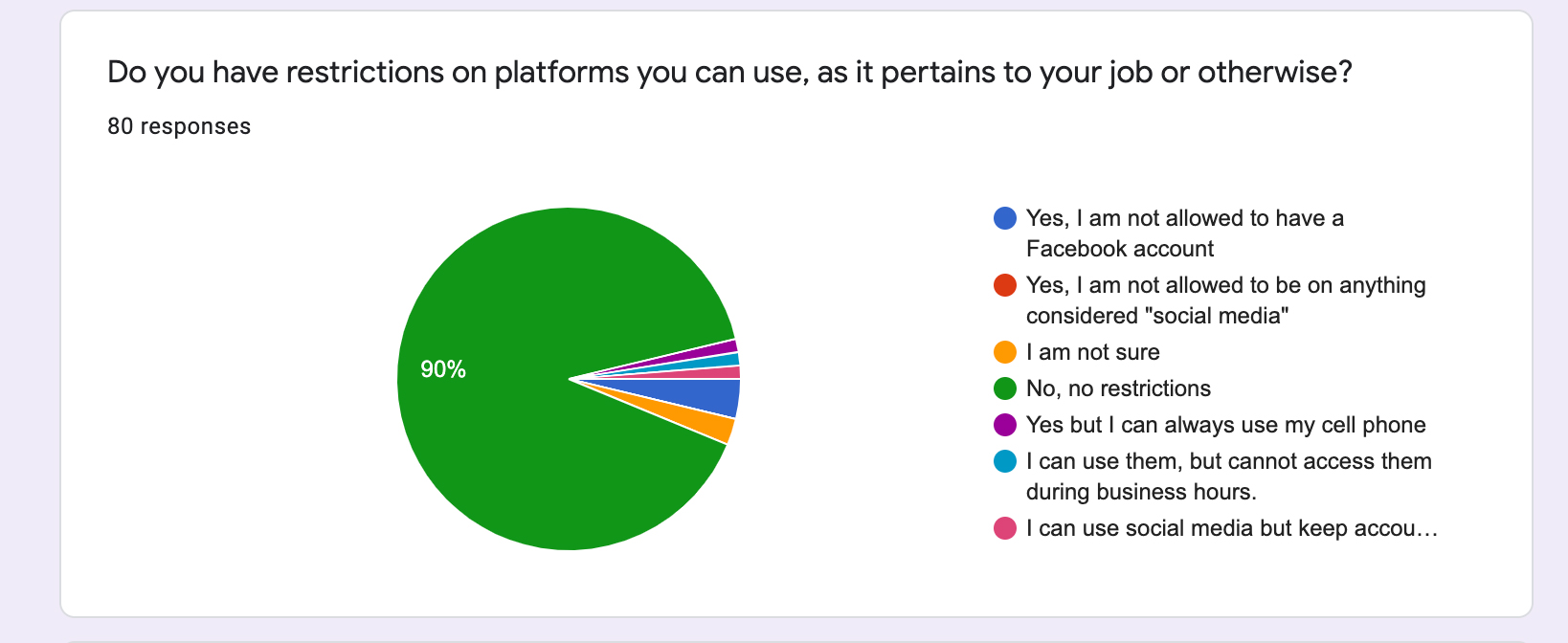
Qualitative Research Question: What type of restrictions do users have on platforms they can use?
Most people didn’t have social media restrictions, but some did. Most people preferred slack or a google spreadsheet. People HATED Nextdoor. And we got some more platform suggestions to check out (groups.io, discord, phpBB, myBB).
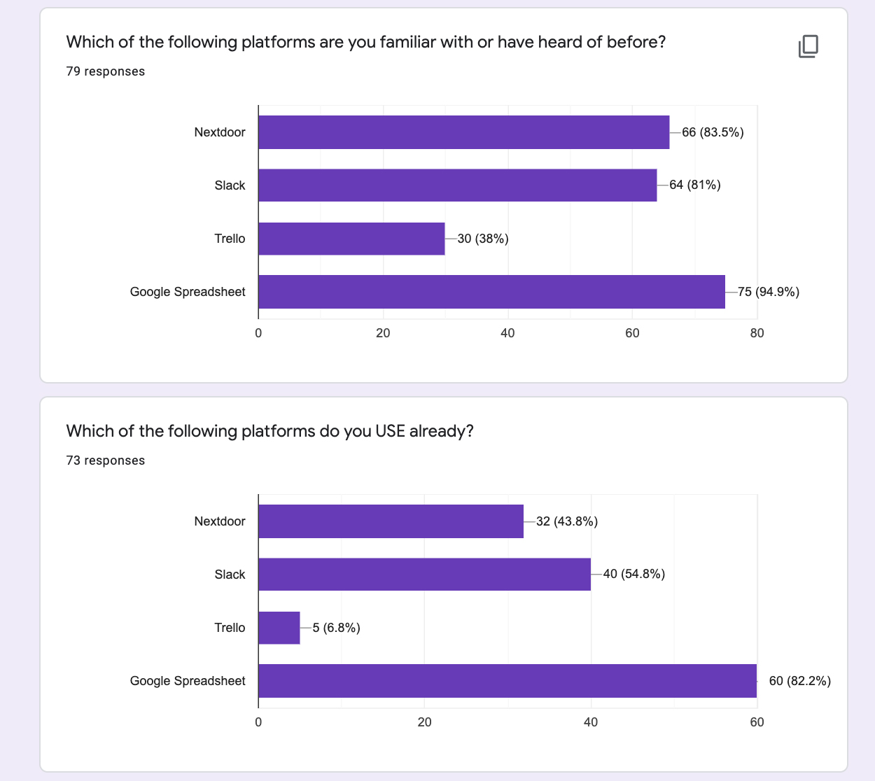
Quantitative Questions: Which of these platforms are users already familiar with? Which do they already use?
Ideation
Test communities
From the feedback, I set up and analyzed test communities in slack, trello, google spreadsheet, discord, groups.io, and nextdoor. I eliminated phpBB and myBB because they require users to download software. I eliminated basecamp because it costs money, and I eliminated wix forums since the HRA site didn’t use wix.
For discussions with the director, I created a spreadsheet comparing the various options in how they fit into our system requirements.
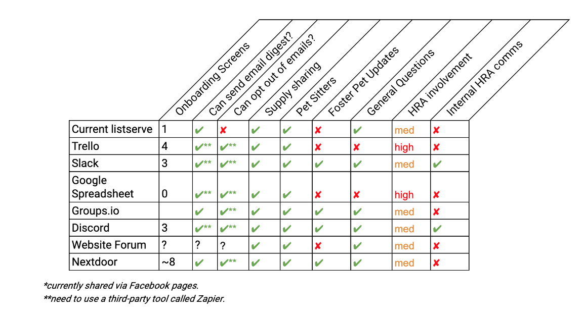
Comparative Feature Chart across proposed alternatives to the Google Group.
The best options were those that were low in HRA staff involvement, covered everything needed, and had minimal onboarding screens.
Out of the spreadsheet, the most competitive were Slack and Groups.io. After looking into Zapier for email automation, it became clear we were going to have to use the paid version and would still not have the same amount of options groups.io had for email preferences. We decided on groups.io and I began to refine the community.
Groups.io offers nearly endless features and can be overwhelming to set up. I did an informational interview with the moderator of the Cleveland Park groups.io page to see how a similar group ran their listserve. The moderator gave insight into the paid version, FAQs for her community, and what settings she had enabled.
Refinement
After creating a test community with only minimum features enabled, we shared the join link with a small group of users as a soft user acceptance test. Without help, is this better than the current process? Would people like it? I had prepared a basic guide for the director, and we shared that along with the link to sign up.
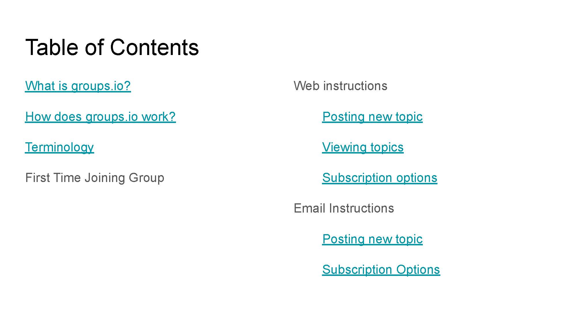
Groups.io instructions for test users.
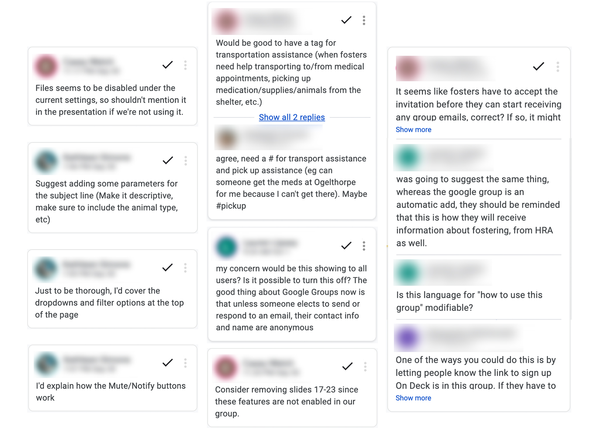
Google Slide feedback from users.
The overwhelming feedback was users needed a detailed ‘user guide’ for the new platform. They wanted directions on every task a user could accomplish in the app. They also wanted a separate one for those with admin privileges - HRA staff and senior volunteers - to know how to add, remove, and update the wiki page. I ended up creating an extensive user guide, refining the welcome email to include instructions, and refine the group description to include instructions. I was now ready for detailed usability testing.
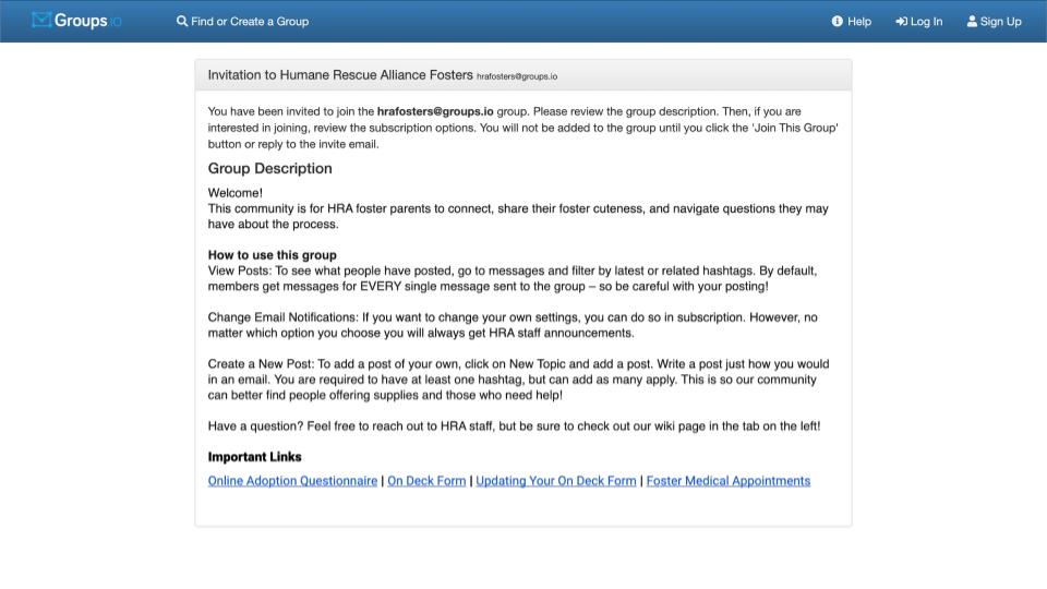
Group description with directions on how to use the group.
Extensive user guide.
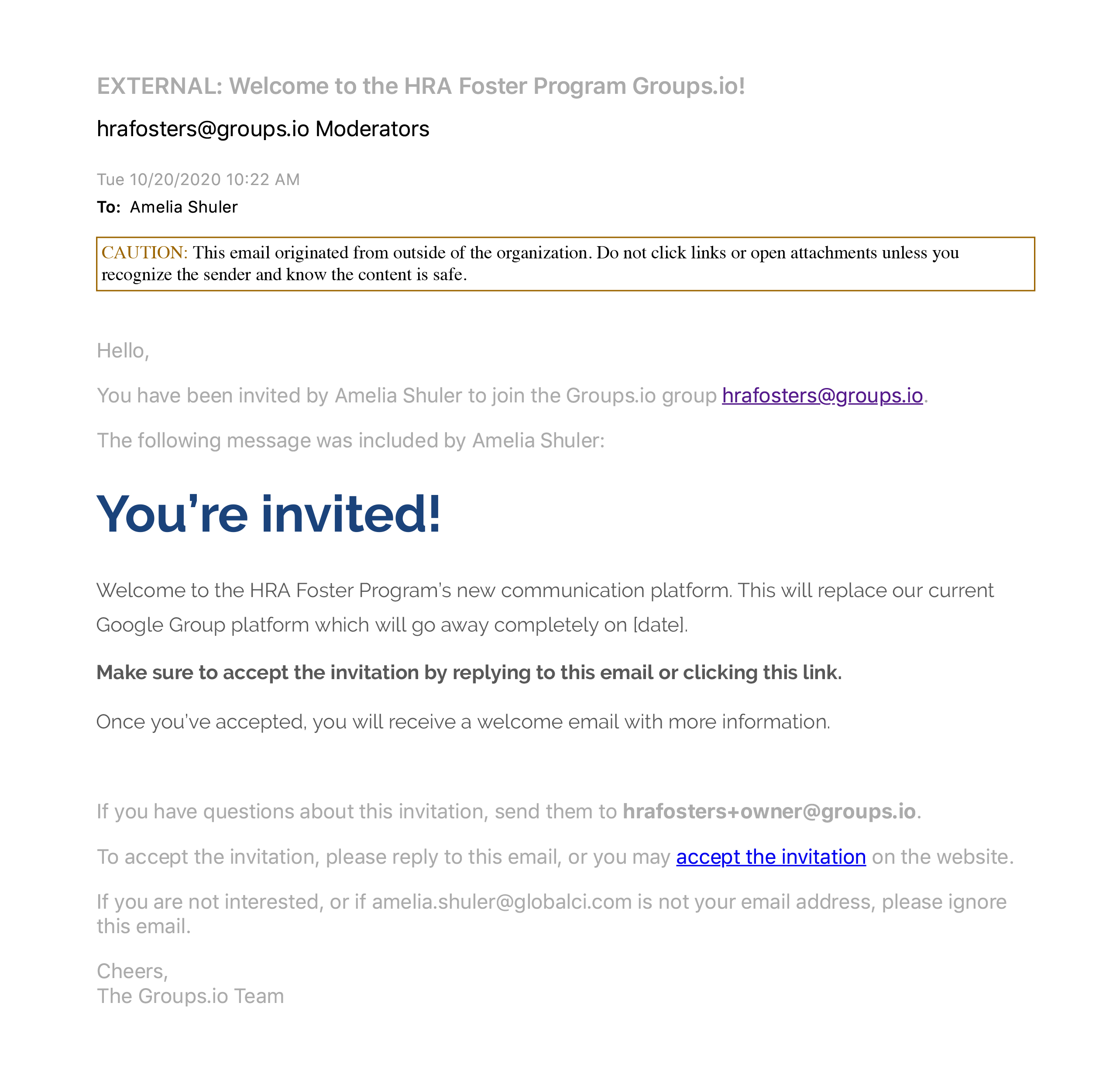
Groups.io invitation to sign up with link to user guide.
Usability Testing
I conducted 6 usability tests over Google Meets and had them share their screens while I recorded. I also took notes for the qualitative questions I asked. I tried to test from those within all demographics that would use the group– foster parents, volunteer case managers, technology-friendly users, and technology-adverse users.
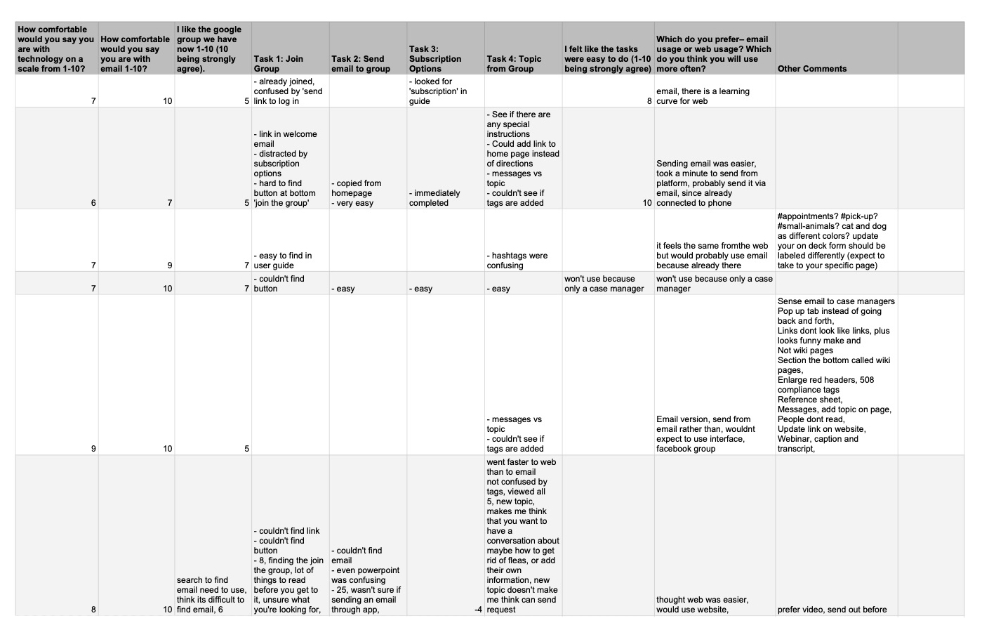
Feedback from users through guided usability testing.
How would I quantify that? I was hoping by asking the question “how comfortable are you with technology (1-10, 10 being most comfortable)” users would self-identify their comfort level with technology. However, the users that had no issues with technology on the call (whether it was joining the call itself, or the platform) ranked themselves in the 6 range, and those who did have technology-issues (trouble getting on the call, screen sharing, or navigating the group) ranked themselves as a 10. Looking back, a better question might’ve been “how many times a day do you interact with the internet?” People who are comfortable may feel pressure to rank themselves lower, as to not appear overly confident. Those who aren’t as comfortable might feel they need to rank themselves higher, so as not to appear ‘under qualified.’ The unfortunate part of a usability test is it feels to users that THEY are being tested, not the technology.
Since this caused issues determining if I had captured all demographics, I instead stopped my first round of usability testing when I stopped hearing users encounter new problems.
Findings
Theme 1: Of the 6 participants, 5 struggled to find the “join the group” button at the bottom of the page. The issue? The platform displayed the group’s ‘description’ along with subscription options. The button was out of frame. There was not enough to indicate that there was an action needed from the user.
Demonstration of button being out of frame for users.
Theme 2: Additionally, 5 participants were confused by the two links in the sign-up email. One was how to use the group, and the other was joining the group. Users often clicked the first link (the guide), continued without reading the guide, and had to restart the task.
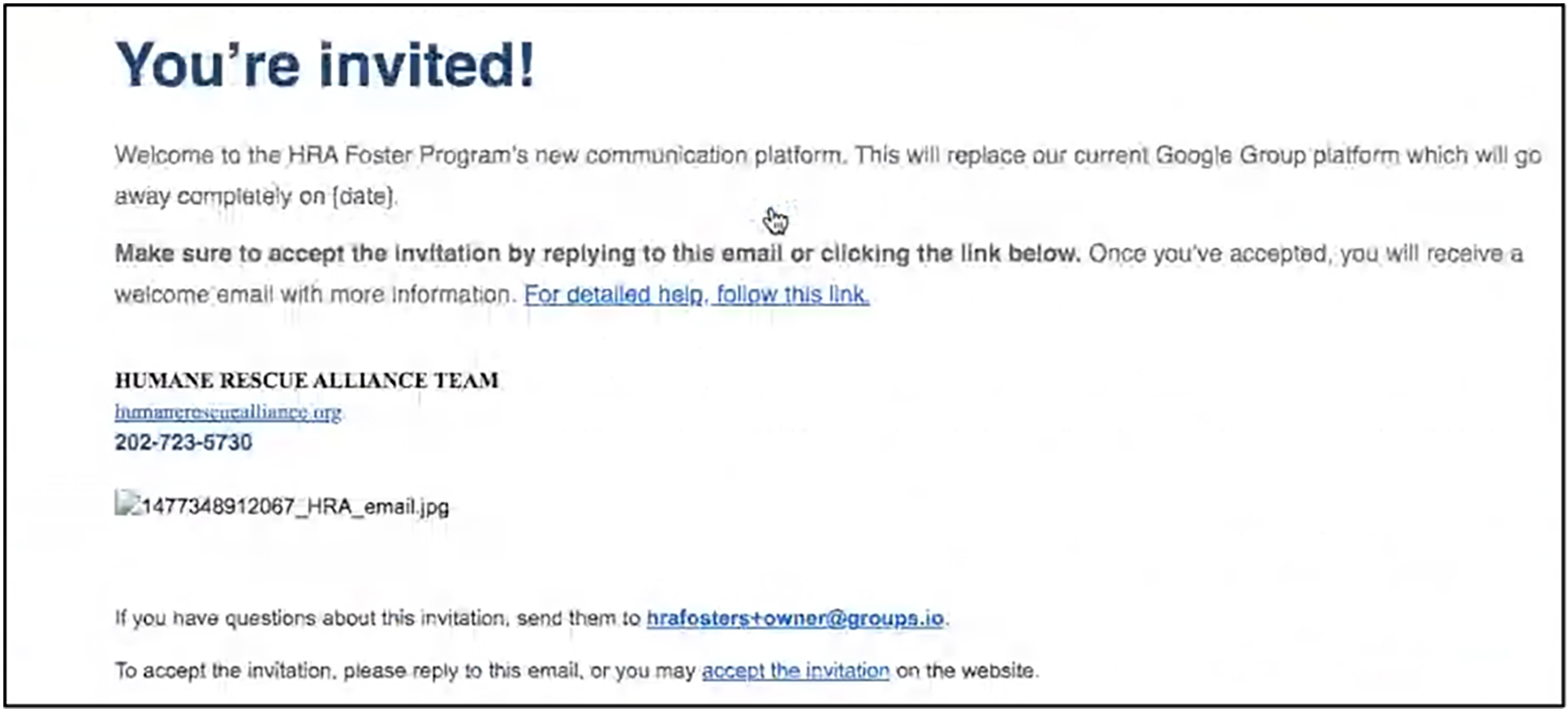
Demonstration of two hyperlinks in sign up email.
Theme 3: Finally, the platform enforces the use of hashtags to categorize messages. This is only revealed on the web platform, but doesn’t explain what they are or how to use them. 4 of the users had trouble with the ‘hashtags’ while sending a post from the website version. They understood to add them, but were not expecting where they showed up (in the subject line). Most importantly, it wasn’t clear why they were necessary.
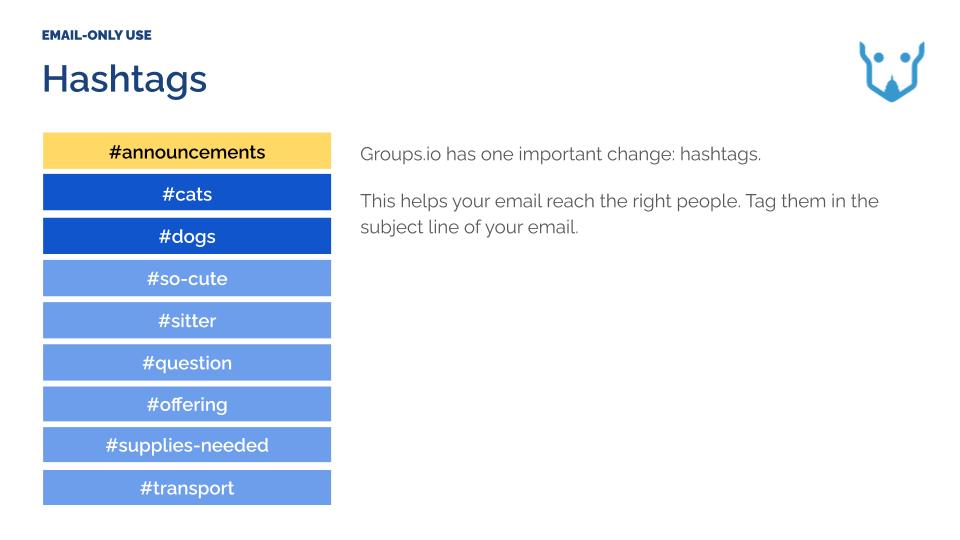
Demonstration of hashtags in ‘How-To’ documentation.
While this is a secondary goal for this round of usability testing, a future consideration must be how to convey the importance of hashtags while they are being used, and not in a separate training or guide. My main takeaway from all of this was that the majority of users will not read the user guide. Of the 6 users, only one looked at the user guide.
